
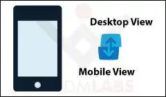
 We take a lot of effort in every theme we develop to ensure that it best suits the client needs. Apart from the stated objectives, the understood requirements are building an SEO friendly, speedy, and responsive site. This particular article has been inspired by a use case in a client’s custom theme development project. The client wanted a responsive website. But there was a specification to provide an option as a link to force the desktop version on a mobile device.
Basically the requirement was this, when the site was opened on a mobile device, there had to be an option, ‘View Desktop Version’, which basically rendered the site as it would be visible on a desktop computer. As far as the implementation goes, this involves turning off the responsiveness aspect of a site.
Meta Viewport Tag
In a previous article, we had mentioned, how to make images and text responsive. By following the same principles here, while developing a theme, we have to understand the importance of the Viewport meta tag. Basically the viewport information, is the most important factor, which helps identify the device the site is being displayed on.
And for a responsive website, this tag would be placed in the header as follows:
<meta name="viewport" content="initial-scale=1, width=device-width">
Here, ‘width’, set to device width, shapes the view of the website according to the device. Thus, if we change this information, we can fool the site to believe, that the device is a desktop and the browser engine will take care of rendering the desktop version.
Showing the Desktop Version on a Mobile Device
Now, to begin with the implementation. First of all, we need to add a link in the site, ‘Show Desktop Version’, which will be visible on a mobile device. Add the following HTML code, as appropriate, in the header or footer, of your theme.
<!--hyperlink to change browser layout-->
<a href="#" class="mobileSpecific" id="viewDesktopLink">Show Desktop Version</a>
The class ‘mobileSpecific’, has to be added in the style.css of your theme, to ensure that the link is visible only on a tablet or a mobile device.
/* for desktop devices or wide screens, do not show the link */
@media only screen and (min-width: 980px)
{
  .mobileSpecific
  {
   display:none;
  }
}
Next, we need to make the switch when a user clicks the link. For this we will use JavaScript. Add this code in the functions.php of your theme, or appropriately place the JavaScript code in your WordPress site, as per your needs.
add_action('wp_head', 'myCustomFunction');
function myCustomFunction()
{
if ( wp_script_is( 'jquery', 'done' ) )
{?>
  <script type="text/javascript">
  var desktopBreakpoint = 980;
  jQuery('#viewDesktopLink').click(function(e) {

  // prevent default link action
  e.preventDefault();

  // set viewport content width
  jQuery('meta[name="viewport"]').attr('content', 'width=' + desktopBreakpoint );
});
</script>
<?php }
}
This code will basically set the viewport information, to force the desktop layout. Note, that we have used 980 as the desktop breakpoint. You need to set a value accordingly. Also, this is just one part of the solution. The other is to provide the user an option to switch back to the mobile site.
To allow the user to switch back to the mobile version, your jQuery (in myCustomFunction) would have to be updated as follows:
if(jQuery('#viewDesktopLink').text() == '<?php _e("Show Desktop Version") ?>')
{
  jQuery('#viewDesktopLink').text('<?php _e("Show Mobile Version") ?>');
  jQuery('meta[name="viewport"]').attr('content', 'width=' + desktopBreakpoint );
}
else
{
  jQuery('#viewDesktopLink').text('<?php _e("Show Desktop Version") ?>');
  jQuery('meta[name="viewport"]').attr('content', 'width=device-width');
}
Note that there could be a scenario, that you might still not notice any changes. This could be due to the way your theme was structured, because of which device specific stylesheets were being loaded. In that case, the CSS for the desktop version might not be loaded when the site is opened on a mobile device. In this situation, you would have to explicitly load the CSS for the desktop version.
Further Reading:
- Decoding WordPress SALTS and KEYS
- Add a Custom Title or Image Logo to your WordPress Theme
- Display a Custom Post Type with Custom Sidebar