
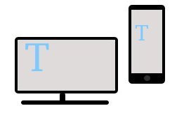
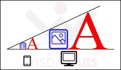 Responsive web design is a web designing method, which is based on providing a resolution independent, optimal viewing experience to the viewer. Optimal viewing experience consists of easy reading and navigation, with minimum panning, scrolling and resizing. With the increase in number of mobile and tablet browsing, it has become the norm to make images and text in a site responsive.
Responsive web designing involves adding viewport meta information and simple style properties to HTML tags. In WordPress sites, you need to add a viewport meta tag in the header.php file, and add the style properties in the style.css, of your theme.
Start by setting the viewport information:
A viewport is area on the screen where the page is displayed, without the scrollbars and browser navigation bar. Usually when mobile devices display a page from your site, they tend to display a zoomed out version of the full page. To avoid this from happening, you need to set the viewport information to compel the device to display the information proportionately.
[pre]
/* initial-scale and width ensure that the page is scaled in proportion to the device width */
<meta name=”viewport” content=”initial-scale=1, width=device-width“>
[/pre]
Making Images Responsive:
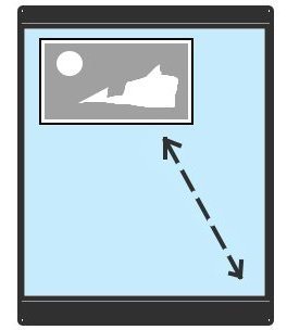
Responsive image implies that images will be scaled in proportion to the display device or browser screen. Images can be made responsive by adding the following properties to the ‘img’ tag (which means that all images will have these properties):
[pre]
img
{
/* assures that the the maximum width of the image will not be bigger than the size of the containing screen */
max-width:100%;
/* assures that the the maximum height of the image will not be bigger than the size of the containing screen. This can be optional depending on your preference */
max-height:100%;
}
[/pre]
Making text responsive:
 Responsive text undertakes providing an appropriate text size depending on the viewing device. For this we would have to use media queries. Using media queries we can have different style rules for different media types. This is the basis of a responsive design.
A media query basically involves a media type (screen or print) and a (true or false) conditional expression involving media features (like width, height or color). Incase it is evaluated to true, the CSS properties contained by the query are applied.
The media query can be directly specified in your stylesheet. For example, if you wanted to set the font size based on the minimum screen width, you could specify the query in the following way:
@media only screen and (min-width: 600px)
{
body
{
/* if media type is screen and condition is true */
font-size: 10px;
}
}
Additional Details:
- The screen media type indicates the device screen or the browser screen
- The ‘only’ keyword does not add any additional meaning, but it is used to hide the media query from old browsers which cannot process these queries.
- You can also specify the media condition while registering and enqueuing a stylesheet. Please refer this link for further information.
Hence if we wanted to make the paragraph text (identified by HTML tag ‘p’) responsive, we would have to do the following (note that this is just an example, you can set the conditions according to your preference) :
[pre]
p
{
/* enforces that text is re-aligned depending on browser or screen width */
word-wrap: break-word;
}
/* Incase the screen size is that of a tablet landscape size or above */
@media only screen and (min-width: 769px)
{
p
{
font-size: 14px;
}
}
/* mobile landscape size to a tablet portrait size */
@media only screen and (min-width: 481px) and (max-width: 768px)
{
p
{
font-size: 12px;
}
}
/* mobile portrait size or below */
@media only screen and (max-width: 480px)
{
p
{
font-size: 11px;
}
}
[/pre]
Note: This is a simple yet assured way to make images and text responsive. But this is only one part of the responsive web design. The other part is creating a fluid layout. You can read about Creating a Responsive Layout, in this article.
Let me know if this article helped you, by leaving your comments in the comment section below.