
| Quick Answer
In 2026, you customize a native HTML <select> dropdown in three layers. (1) The baseline that works in every browser today: appearance: none on the <select>, plus a custom SVG background arrow, plus accessible focus styles. (2) Progressive enhancement via the new appearance: base-select (shipping in Chrome 135+ and Edge, behind a flag in Safari Technology Preview, not yet in Firefox), which lets you style the dropdown panel and options without a single line of JavaScript. (3) An accessibility pass: visible focus ring, sufficient colour contrast in both light and dark mode, native keyboard behaviour preserved. The 2014 width-hack trick from the original version of this guide still works, but it’s no longer the right answer. |
 Do you know the feeling you get, when you spend several hours toiling to make everything look perfect, only to be beaten by a browser! Let me explain. So, my day began by testing out a page I was building for a client’s website. And that it when I noticed a problem. While this particular *irk* would have gone unnoticed by an untrained eye, my UI designer goggles took a note of it right away.
The problem was, that in different browsers, the select field was being rendered differently. Which I know, isn’t a recent problem. The thing is, every browser renders the field in its own way. Firefox being the worst (in this case)… worst! And this inconsistency was a dark stain on my work-of-art.
So, let’s cut short the drama :D . The next thing I did was obviously try to fix this problem. By googling about it. I wasn’t ready to be beaten that easily. Some forums suggested I use the -moz-appearance or -webkit-appearance properties, but I couldn’t find a solution that actually worked.
We at WisdmLabs first published this tutorial in 2014, when the only path was hiding the native browser arrow with an overflow: hidden trick and overlaying a PNG. That worked then. It still works, but you no longer need it. Browsers have caught up. Native CSS now styles 90% of what you used to need JavaScript dropdown libraries for, and the remaining 10% is closing fast. This update covers the modern path, accessibility, dark mode, and where the platform is heading in 2026.
Why This Is a 2026 Problem, Not a 2014 Problem
Two things changed in the last decade.
Appearance: none is now universally supported. Per Can I Use data on the CSS appearance property, appearance: none works in 97%+ of global browsers as of May 2026. The -moz-appearance and -webkit-appearance vendor prefixes are no longer needed for this property on current Firefox, Safari, Chrome, or Edge. You can write one declaration and ship.
Appearance: base-select opens up the native dropdown panel itself. As Chrome for Developers announced, Chrome 135 introduced full CSS control over the <select> element, including the dropdown panel, options, arrow icon, and selected state. Per Can I Use, Safari has it behind a Technology Preview flag, Firefox is reviewing the spec, and global “shipping by default” support sits at around 75% in May 2026 and climbs every month.
What this means practically: the workflow that took 200 lines of JavaScript and a third-party library in 2014 takes 30 lines of CSS in 2026 for Chromium browsers, and a clean fallback for the rest.
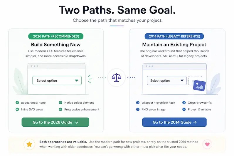
Which Approach Should You Use?
Whether you’re building a new project or maintaining an older one, this guide covers both modern best practices and the original workaround that helped developers style dropdowns long before today’s CSS features existed.
- Building a new website or application in 2026? Start with The Three Layers of Modern Dropdown Styling below.
- Maintaining an older project or legacy WordPress theme? Scroll down to The Original 2014 CSS Workaround (Legacy Method).
- Modernizing an existing implementation? Read both sections to understand what has changed and how to simplify your code using modern browser capabilities.
The Three Layers of Modern Dropdown Styling (The 2026 Path)
| Layer | What it gives you | Browser support |
| Baseline: appearance: none + SVG arrow | Custom closed state on the <select>: background, border, padding, arrow icon | All modern browsers (97%+) |
| Progressive enhancement: appearance: base-select | Full styling of the open dropdown panel, options, animations | Chrome / Edge 135+, Safari Technology Preview, ~75% global |
| Accessibility & themes | Focus ring, contrast, keyboard, dark mode, mobile | Universal (CSS) |
Build them in this order. The baseline always works; the enhancement progressively layers on top.
Layer 1: The Baseline That Works Everywhere
This is the 2026 replacement for the 2014 width-hack. Strip the OS chrome, add your own background arrow, control the typography and spacing.
| .dropdown {
/* Remove native chrome */ appearance: none; -webkit-appearance: none; -moz-appearance: none;
/* Your design */ background: #ffffff; border: 1px solid #cccccc; border-radius: 6px; padding: 10px 36px 10px 14px; font-size: 14px; line-height: 1.4; color: #2b2b2b; cursor: pointer;
/* Custom arrow via inline SVG background */ background-image: url(“data:image/svg+xml;utf8,…chevron SVG…”); background-repeat: no-repeat; background-position: right 12px center; background-size: 14px;
/* Don’t let long options break the layout */ max-width: 100%; }
.dropdown:focus-visible { outline: 2px solid #1A3A6B; outline-offset: 2px; border-color: #1A3A6B; } |
Three things to notice. First, the SVG is inlined as a data URI so there’s no extra HTTP request, no external image dependency, and the colour is part of the CSS (which lets dark mode swap it cleanly). Second, the right padding leaves room for the arrow without overlapping the longest option text. Third, the :focus-visible ring is mandatory; without it, keyboard users lose track of the cursor and you fail WCAG 2.4.7.
The corresponding HTML is the same boring native <select> you’ve always written. No wrapping divs, no JavaScript:
| <label for=”category” class=”dropdown-label”>Category</label>
<select id=”category” name=”category” class=”dropdown”> <option value=””>Pick one</option> <option value=”1″>Happy</option> <option value=”2″>Great</option> <option value=”3″>Nice Solution</option> <option value=”4″>Awesome</option> </select> |
That’s the entire baseline. Drop it in, screenshot in 5 browsers, ship. (For the broader pattern of avoiding clever-but-fragile frontend choices, our recent breakdown of WordPress development setup mistakes that create tech debt catalogues the ones that bite you 12 months later.)
Already familiar with our original 2014 tutorial?
The wrapper elements, width hacks, and overflow tricks from the original method are no longer required for most modern browsers. With appearance: none, you can style the native <select> directly while preserving its built-in accessibility and functionality.
Layer 2: Style the Open Dropdown Panel with appearance: base-select
This is the part that was impossible without JavaScript until 2025. The appearance: base-select value tells supporting browsers: “let me style the picker too, not just the closed state.”
| @supports (appearance: base-select) {
.dropdown, ::picker(select) { appearance: base-select; }
.dropdown::picker(select) { background: #ffffff; border: 1px solid #cccccc; border-radius: 8px; padding: 6px; box-shadow: 0 8px 24px rgba(0, 0, 0, 0.12); }
.dropdown option { padding: 8px 12px; border-radius: 4px; cursor: pointer; }
.dropdown option:hover, .dropdown option:checked { background: #E8EEF7; color: #1A3A6B; }
/* Optional: animate the panel open */ .dropdown::picker(select) { transition: opacity 150ms ease, transform 150ms ease; } } |
The @supports query is the critical wrapper. Chrome 135+ and Edge get the styled panel; Firefox falls through to Layer 1’s baseline; Safari users get the baseline until the feature ships out of Technology Preview. Nothing breaks anywhere.
As MDN documents in its customizable select element guide, base-select also unlocks rich content inside <option> elements (images, spans, layout). You can now write a country picker with flag icons next to country names without a single line of JavaScript:
| <select class=”dropdown country-picker”>
<option value=”us”><img src=”/flags/us.svg” alt=””> United States</option> <option value=”in”><img src=”/flags/in.svg” alt=””> India</option> <option value=”ae”><img src=”/flags/ae.svg” alt=””> United Arab Emirates</option> </select> |
In supporting browsers this renders as a styled picker with flag icons. In non-supporting browsers it renders as a normal native select with the flag images stripped to text fallbacks. Both are acceptable.
Layer 3: Accessibility, Dark Mode, and Mobile
This is the part the 2014 article skipped entirely. In 2026, none of it is optional.
Focus and keyboard
Every interactive element needs a visible focus ring. We used :focus-visible above, which is the right primitive. It shows the ring when a keyboard user tabs to the element and hides it for mouse clicks. Per the WCAG 2.2 accessible dropdowns guide, a native <select> already comes with full keyboard behaviour out of the box: Space/Enter to open, arrow keys to move between options, Enter to select, Escape to close. Do not replace this with a custom JavaScript widget unless you’re prepared to reimplement all of it (and most teams that do, get it wrong).
Colour contrast and dark mode
The contrast between option text and the picker background must hit 4.5:1 minimum for body text (WCAG AA). In dark mode, the same rule applies. Wire your dropdown to the system theme using a CSS custom property pattern:
| :root {
–dd-bg: #ffffff; –dd-text: #2b2b2b; –dd-border: #cccccc; –dd-accent: #1A3A6B; –dd-hover-bg: #E8EEF7; }
@media (prefers-color-scheme: dark) { :root { –dd-bg: #1a1a1a; –dd-text: #f0f0f0; –dd-border: #444444; –dd-accent: #7AA3E8; –dd-hover-bg: #2a3a5a; } }
.dropdown { background: var(–dd-bg); color: var(–dd-text); border-color: var(–dd-border); } |
The SVG arrow uses URL-encoded inline stroke, so to match the theme, swap the entire background-image declaration inside the dark-mode block (use the same SVG with stroke=’%237AA3E8′).
Mobile and touch
On iOS and Android, native <select> opens the system picker, which is the right behaviour for almost every case: large touch targets, momentum scroll, accessibility built in, no zoom needed. Do not override this with a custom JavaScript dropdown unless you have a very specific reason. A dropdown with multi-column options or rich filtering is a reason. A dropdown that looks slightly different on iPhone is not.
The one thing to add for mobile: a font-size of at least 16px on the <select> itself. iOS Safari auto-zooms into form controls smaller than 16px, which is jarring and almost never what you want.
| .dropdown { font-size: 16px; } |
When to Use a Native <select> vs a Custom JS Dropdown
Build a custom JavaScript dropdown only when you actually need one of these. Native <select> covers more cases than most teams assume.
| Need | Use native <select> | Use a JS combobox |
| Pick one of 5 to 50 options | ✓ | |
| Pick one of 1,000+ options (countries, products) | with <datalist> | ✓ |
| Type-ahead search inside the list | ✓ | |
| Multi-select with checkboxes | ✓ | |
| Multi-column or grouped rich content | ✓ (with base-select) | ✓ |
| Async-loaded options | ✓ | |
| Icons or images inside options | ✓ (with base-select) | ✓ |
| Mobile-friendly out of the box | ✓ | requires real work |
If you’re picking a JS combobox, pick a maintained library that’s actually accessible (Headless UI, Downshift, Radix UI). Don’t roll your own from a CodePen. The keyboard, ARIA, and focus-trap details are where it goes wrong.
Updating an Existing Dropdown? Here’s What Changes
If you’re maintaining a website built a few years ago, chances are your dropdown styling looks very different from the approach recommended today. The good news is that modern browser support has eliminated many of the workarounds developers once relied on.
Here’s a quick comparison between the original technique and the modern approach.
| Then (2014) | Now (2026) |
|---|---|
Wrapper <div> elements around the <select> |
Style the native <select> directly |
overflow: hidden to hide the browser arrow |
appearance: none |
| PNG or image-based arrow icons | Inline SVG background images |
| Width hacks for browser consistency | Standard CSS spacing and padding |
| Browser-specific workarounds | Standardized CSS properties |
| JavaScript libraries for basic styling | Native CSS with progressive enhancement |
If you’re maintaining an existing project, the original tutorial below will help you understand these legacy techniques. If you’re building something new, you can safely follow the 2026 approach instead.
The Original 2014 CSS Workaround (Legacy Method)
Everything you’ve read so far reflects the recommended approach for styling dropdowns in modern browsers.
The section below is the original tutorial we published in 2014, preserved for developers maintaining older websites, legacy WordPress themes, or projects that still rely on techniques from that era.
Before widespread support for features like appearance: none and appearance: base-select, developers often relied on wrapper elements, overflow tricks, and custom arrow images to achieve consistent styling across browsers. While these techniques are no longer necessary for most new projects, they remain useful if you’re working with older codebases or supporting legacy environments.
If you’re starting a new project today, use the 2026 approach above. If you’re maintaining an existing implementation, the original tutorial below remains a valuable reference.
Style the Drop-Down List with CSS (The 2014 Path)
Now, I knew that I needed some CSS, which I had to use in the right way to solve this problem. But it wasn’t very obvious, till one of my experiments actually gave me an idea.
If You Can’t Change it… Hide It!
Since the problem was mainly the drop-down button, a simple option was to hide it, across all browsers, and to replace it with your own image to make the select element appearance consistent across all browsers. I’ll explain it to you in a step by step process.
1. Place the Drop-Down List inside a Container
To begin with, we need a defined area for the select field. This area will have to be marked by a div container, and the select field is placed inside another div.
<div class="search_categories">
    <div class="select">
       <select name="search_categories" id="search_categories">
          <option value="1" selected="selected">Happy</option>
          <option value="2">Great</option>
          <option value="3">Nice Solution</option>
          <option value="4">Awesome</option>
        </select>
     </div>
 </div>
The outer div container marks the area the drop-down will appear in the browser. The inner div contains the drop-down list. Let’s add some basic CSS before we continue:
.search_categories{
  font-size: 13px;
  padding: 10px 8px 10px 14px;
  background: #fff;
  border: 1px solid #ccc;
  border-radius: 6px;
  position: relative;
}
So here’s what we’ll have:

2. Increase the Width of the Drop-Down List
Next, is to increase the width of the drop-down list, so that a part of the list is actually outside the containing outer div. And this is done using CSS of course. And while we’re at it, let’s style the drop-down list as well. And you have entire liberty to style it in the way you need.
.search_categories .select{
  width: 120%;
}

.search_categories .select select{
  background: transparent;
  line-height: 1;
  border: 0;
  padding: 0;
  border-radius: 0;
  width: 120%;
  position: relative;
  z-index: 10;
  font-size: 1em;
}
Here’s what we’ll have:
3. Hide the Drop-Down Button
The final step is to cut down the width of the list, by simply hiding it using CSS. You know what you have to do here! Just add overflow:hidden to the search_categories class.
4. Refine the Appearance
Oh yes! I almost forgot. So the field, might not appear as a list to users, on account of the drop-down button being hidden. So to make the field an intuitive drop-down list, the final-est step is to modify the select class a bit, and add a background arrow image.
.search_categories .select{
  width: 120%;
  background:url('arrow.png') no-repeat;
  background-position:80% center;
}
And done!

All the CSS in one place…
To help you out, here’s all the CSS I’ve used, in one place!
.search_categories{
  font-size: 13px;
  padding: 10px 8px 10px 14px;
  background: #fff;
  border: 1px solid #ccc;
  border-radius: 6px;
  overflow: hidden;
  position: relative;
}

.search_categories .select{
  width: 120%;
  background:url('arrow.png') no-repeat;
  background-position:80% center;
}

.search_categories .select select{
  background: transparent;
  line-height: 1;
  border: 0;
  padding: 0;
  border-radius: 0;
  width: 120%;
  position: relative;
  z-index: 10;
  font-size: 1em;
}
As a UX developer, I want every bit to be perfect, even if it involves adding some additional CSS. And even though the problem did not break any functionality, it was important to fix, to improve user experience. So, although my day started out bad… it ended happy because I fixed the problem :) …. So, if you’re looking for something similar, do try this, and let me know if it helped you out. Cheers!
Should You Still Use the 2014 Method?
For most new websites, no.
Modern browser support for appearance: none and the emerging appearance: base-select specification means developers can create consistent, accessible dropdowns with far less code than was possible a decade ago.
However, if you’re maintaining an older project that already uses wrapper-based techniques or needs to support legacy browser environments, the original workaround below remains a practical reference. Rather than removing that guidance, we’ve preserved it to help developers working across both modern and legacy codebases.
Frequently Asked Questions
Can I fully style a <select> element with CSS in 2026?
For the closed state, yes — appearance: none plus your CSS gives you complete control over the background, border, arrow, focus, and typography in every modern browser. For the open dropdown panel, you can fully style it in Chrome 135+ and Edge via appearance: base-select. Safari and Firefox don’t yet support the panel styling as of May 2026, so use it as a progressive enhancement with @supports, not a baseline.
Do I still need -moz-appearance and -webkit-appearance?
No, not for current browsers. The unprefixed appearance property is supported in all major browsers. The vendor-prefixed versions are only useful if you need to support browsers older than Chrome 84, Firefox 80, or Safari 15.4 — almost never the case in 2026. Drop them unless you have specific legacy traffic.
How do I style the dropdown options without JavaScript?
In Chromium-based browsers, use appearance: base-select on both the <select> and ::picker(select), then style option, option:hover, and option:checked directly. In Firefox and Safari, option styling is still limited to colour and background, and many browsers ignore most CSS on options entirely. The pragmatic 2026 answer: full styling in Chromium as a progressive enhancement, native defaults elsewhere.
What’s the accessibility risk of replacing native <select> with a custom dropdown?
High. A native <select> ships with full keyboard support, screen-reader compatibility, focus management, and platform-native pickers on mobile. Replacing it with a div-based combobox means you have to reimplement all of that, and the Orange Digital Accessibility Guidelines plus WCAG 2.2 give you a 30-item checklist of things you’ll likely miss. Use the native element unless you have a need it can’t meet.
How do I make a dropdown look the same in all browsers?
You won’t, completely. Even with Layer 1 + Layer 2, the open dropdown looks slightly different in Firefox and Safari versus Chrome until base-select ships everywhere. The right goal in 2026 is on-brand and accessible in every browser, not pixel-identical in every browser. The latter is a 2014 design assumption that the platform has moved past.
Does this work with WordPress form plugins like Gravity Forms or Forminator?
Yes. Add your CSS to the theme or a custom CSS plugin and scope it to the form plugin’s class names (.gform_wrapper select, .forminator-input, etc.). The plugin handles markup; your CSS handles presentation. If something breaks (a plugin update changes class names, a conflicting style overrides yours), our Plugin Compatibility Checker is the fastest first-pass diagnostic.