

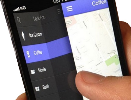
If a client says, that he wants his site ‘mobile ready’, what would you do? The first thing that usually comes to mind is, ‘to make the site responsive’. Okay. Sounds good. But how exactly would you go about doing this? When it comes to handling text and images, there is a simple solution. You can just resize the text and images using media queries. But then what about other elements on the site, like the navigation menu?
When it comes to navigation menus, theme developers are faced with a challenge. Logically, if we reduce the size of the menus, depending on the device size, it would become difficult for users to interact with the menu. If we left the size as is (in the desktop version), and used the float property, the menu might just appear shabby.
Instead, we can provide an alternate structure and display for the navigation menu, on mobile devices. Navigation enhancements like this are commonly implemented during a UX-focused WordPress redesign
to improve usability and engagement.
Using Pushy Navigation in a Genesis Child Theme
In this article, I will explain to you, how to integrate a Pushy Navigation Menu in a Genesis child theme, to provide a mobile friendly navigation menu.
A Pushy Navigation menu, is a kind of navigation menu, which is usually hidden, and can be accessed by the click of a button, or a swipe effect. It gets it’s name, from the fact that it pushes the main content on the side, when it appears. The Hamburger menu is an example of a Pushy Navigation Menu. Such kind of menus can be easily integrated into your Genesis site, using CSS and jQuery.

Identify the Primary Navigation Menu
We have to start by identifying the main menu. (If you do not have the main menu, you wouldn’t be able to change the styling). To identify the main menu, we will wrap it inside a div. To achieve this, add the below code in functions.php of your child theme.
remove_action( 'genesis_after_header', 'genesis_do_subnav' );
// wrap the menu inside a div
add_action( 'genesis_after_header', 'wdm_add_primary_nav_container_div', 9 );
function wdm_add_primary_nav_container_div() {
   echo '<div id="primary-nav-container">';
}

// add the menu
add_action( 'genesis_after_header', 'genesis_do_subnav', 11 );

// close the div
add_action( 'genesis_after_header', 'wdm_close_primary_nav_container_div' );
function wdm_close_primary_nav_container_div() {
   echo '</div>';
}
We will also be adding a button, which will be used on mobile devices to trigger the display of the pushy menu. Just add the below code in functions.php, we will handle the display of the button using CSS.
// display a link on mobile devices to open the navigation menu.
add_action( 'genesis_after_header', 'wdm_pushy_menu' );
function wdm_pushy_menu() {
   echo '<div id="primary-nav-link-container" >
         <a id="primary-nav-link" href="#primary-nav-container">Menu</a>
         </div>';
}
[space]
Use Media Queries to Toggle the Menu Style
At this point, we haven’t changed the styling of the navigation menu. The primary navigation will be displayed as per the styling provided by your theme. To change the styling of the navigation menu for a mobile device, we will be using media queries. Add the following in style.css of your child theme. (You can use additional properties to style the menu link)
/* on mobile devices, do not display the default style*/
@media only screen and (max-width: 1023px) {
    #primary-nav-container {
          display: none;
    }

/* instead display a single button */
    #primary-nav-link-container {
          display: block;
    }
}

/* also, hide this button for desktop sites */
@media only screen and (min-width: 1023px) {
    #primary-nav-link-container {
          display: none;
    }
}
[space]
Add the ‘Push’ Effect using jQuery Plugins
According to the CSS we have specified, the primary navigation menu will be hidden on a mobile device, and a (Menu) button will be displayed instead. To get the desired ‘push’ effect, on button click, we have to use jQuery plugins.
We will use two jQuery plugins, namely Sidr and Touchwipe. Sidr is used to actually add the push effect on button click. And Touchwipe is used to provide the swipe effect, (which you usually see) on iPhones and iPads. To include these in your theme, you have to add the below code in functions.php of your child theme.
add_action( 'wp_enqueue_scripts', 'wdm_enqueue_pushy_nav_scripts' );
function wdm_enqueue_pushy_nav_scripts() {
    // add sidr
    wp_enqueue_script( 'sidr',  get_stylesheet_directory_uri() . '/js/jquery.sidr.min.js', array( 'jquery' ), '1.0.0', true );

    // add touchwipe
    wp_enqueue_script( 'touchwipe',  get_stylesheet_directory_uri() . '/js/jquery.touchwipe.min.js', array( 'jquery' ), '1.0.0', true );
}
Since, we have our primary navigation menu inside a div, we have to just replace the styling of this div, to the styling provided by these plugins. The push effect, will then be applied to the main navigation menu. For this, we have to create two files, jquery.sidr.min.init.js and jquery.touchwipe.min.init.js.
Create these files in your-theme/js/ directory and add the respective code in the files.
// add in jquery.sidr.min.init.js
jQuery(document).ready(function($) {
    $('#primary-nav-link').sidr({
            name: 'sidr-primary-nav',
            source: '#primary-nav-container'
      });
});
// add in jquery.touchwipe.min.init.js
jQuery(document).ready(function($) {
    $(window).touchwipe({
         wipeLeft: function() {
                // close the navigation menu
                $.sidr('close', 'sidr-primary-nav');
         },

         wipeRight: function() {
               // open the navigation menu
               $.sidr('open', 'sidr-primary-nav');
         },
         preventDefaultEvents: false
   });
});
The final step is to enqueue the scripts you just created. Add the following wdm_enqueue_pushy_nav_scripts function, that you had created.
wp_enqueue_script( 'sidr-init',  get_stylesheet_directory_uri() . '/js/jquery.sidr.min.init.js', array( 'sidr' ), '1.0.0', true );
wp_enqueue_script( 'touchwipe-init',  get_stylesheet_directory_uri() .'/js/jquery.touchwipe.min.init.js', array( 'touchwipe' ), '1.0.0', true );
[space]
And there you have it. Your Genesis child theme will be ready with a pushy navigation menu for mobile devices. Coming back to it’s importance in responsive design, restructuring the navigation menu, using pushy navigation, is an easy option you can use, to make a site mobile friendly. There are a few people who argue against the use of pushy navigation, claiming it’s too common a design and is un-imaginitive. But this very reason, implies that a user would have no trouble using such a menu, because they would be familiar with it, and could easily navigate across your site. What do you think? Can you suggest other options?
You may also like to read: How to Create a Mega Menu for a WordPress Theme









One Response
This is not working on my site