This is a guest post by Aaron Andre Chichioco. If you’d like to contribute to our blog, feel free to get in touch with us.
In this world of fickle UX trends and changing content formats, calling sticky navigation a trend doesn’t even seem apt anymore, as the first fixed navigation elements began surfacing in the early 2010s. This speaks volumes of its usability as design concepts rarely last that long while maintaining its popularity.
And it doesn’t seem to be falling out of style any time soon, as evidenced by the recent Site of the Day winners, where sticky navigation remains a design staple. Despite its prevalence, though, it’s not a one-size-fits-all solution for all types of websites.
This article is designed to help you find out if it’s for you. Below is a discussion of sticky navigation principles, its pros and cons, applications, and best practices, designed to help you determine whether it’s the right approach for your website.
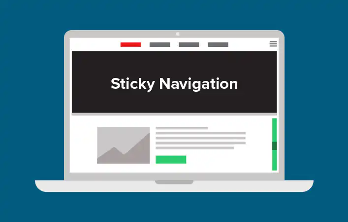
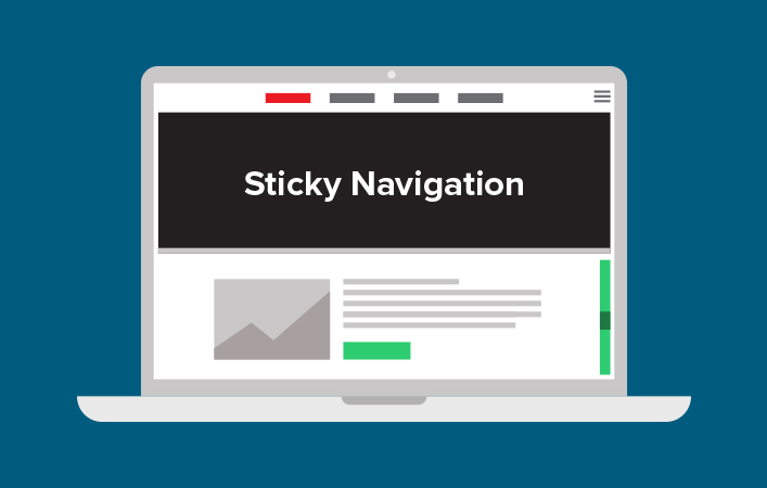
What is sticky navigation?
Sticky navigation refers to having design elements that are permanently on users’ screens even as they scroll down a page. While this was mostly reserved for the navigation bar in its early use, as the world has become more social, social buttons, chat icons, and other communication elements have become popular sticky elements used in web design.
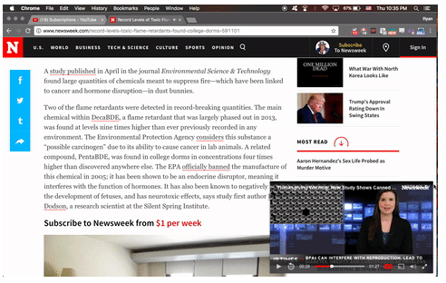
As you can see in the example above, apart from the social and sharing buttons on the left side of the screen, video blocks can also be used as a sticky element.
Pros and Cons of sticky navigation
Pros
If you choose to have a menu bar (or the more popular hamburger button) to be in the user’s permanent view, this allows them to move around the site quicker. In fact, an early study found that fixed navigation bars shave 36 seconds off a five-minute visit to a website.
Another study found that implementing sticky navigation on an e-commerce site was able to increase conversion by close to 3%. That’s a great boost, even before optimizing your product page.
The same study found that sticky navigation resonated with both older adults and younger users. The researchers posited that this was because having sticky elements in permanent view served as a “crutch” in navigating the digital world, preventing users from feeling overwhelmed with options, and knowing exactly where they need to go.
All the above pros ultimately point to advantages in usability, and specifically – speed. It lessens the number of clicks and scrolling needed, and anything that makes users’ life easier is always a good thing when it comes to interaction design – and a step closer to the perfect website navigation.
Cons
Despite sticky navigation being largely a matter of preference, one thing that cannot be contested is that it takes up space. While this may not be an issue on desktop browsers, it’s more pronounced when it takes up valuable mobile screen real estate.
When implemented wrong, sticky navigation elements can serve as a distraction from the actual content.
Sticky menus are trickier for developers to implement, particularly when it comes to mobile design. Apart from the technical challenges, the complication brought about by sticky elements can also increase load times, which is always a user turn-off.
When there’s almost no scrolling to be done on the website, there’s virtually no use for sticky navigation. Additionally, the navigation bar is obscured by the text and images, making it difficult to see it at all. So you always need to look at your site needs when deciding on whether you need sticky navigation, and if you find that you do – ensure that it works across all devices.
How to implement sticky navigation
First off, don’t change the code directly on your live site to ensure that nothing breaks. There are free local development apps that help you set up a test environment where you can follow the steps below. As well, while you can create sticky headers using CSS styling, for the sake of brevity – we’ll show you how to do it on the easiest platform—WordPress.
Creating a sticky header
Now, the way to implement this might differ from theme to theme. Themes like Atelier directly offer an option to activate the sticky header option. We’re going to take the example of Jupiter theme by Artbees to show you how it’s done.
By default, the header builder is disabled on WordPress. You can find the complete steps for how to activate it here. Once you get that out of the way, follow these steps:
- From the WordPress left menu, go to the starred theme, and click on the Settings icon, and enable Sticky Header.
- The Sticky Header Offset decides when the header goes into the sticky header state, while the option below sets how the sticky header is going to behave.
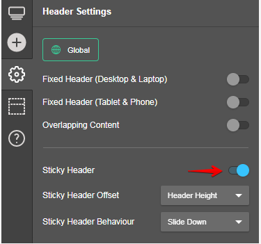
Close the settings tab and click on Sticky Header. From there, you can add different elements to your header.
Once you’re done, click on View on the upper right side to view the changes. And when everything’s set to your preference, scroll down to activate the sticky header.
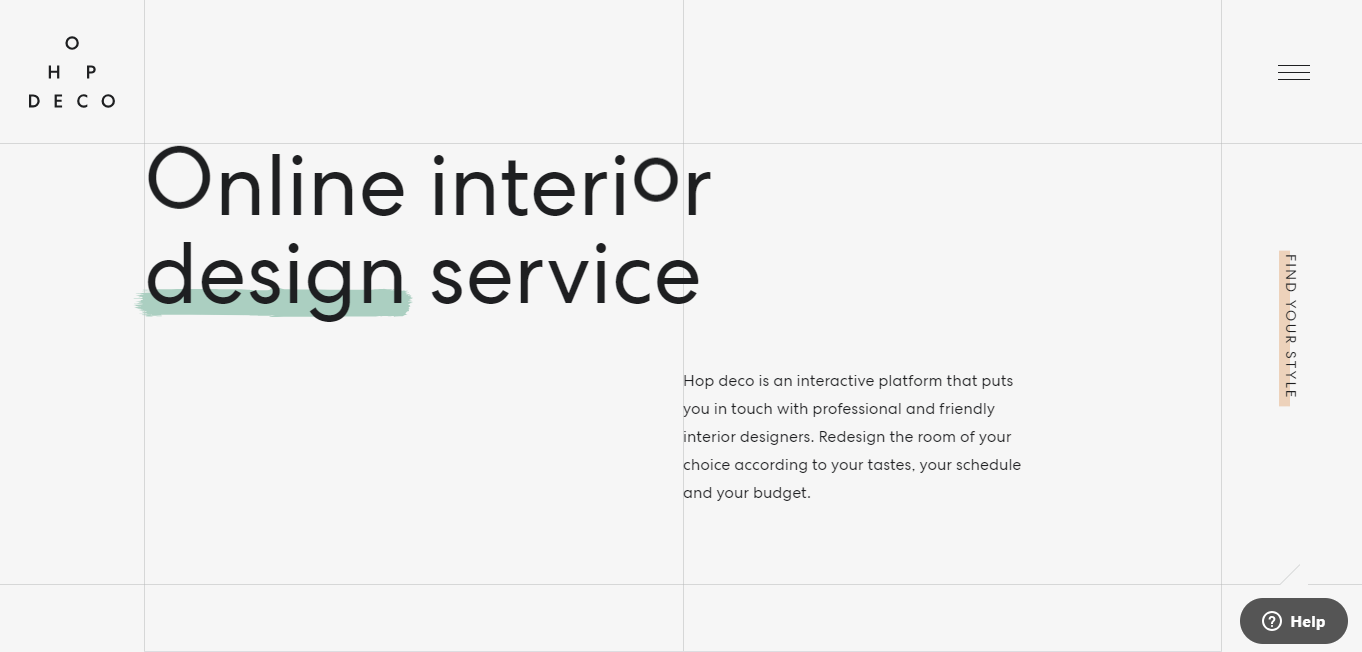
Sticky navigation done right
HopDeco shows not all of it has to move:
To begin with, it’s important to note that there’s a difference between a sticky and a fixed header. The latter shows the main header content by default even as you scroll down, while the former is one that will only be displayed when the user scrolls down the page. HopDeco sticks with the sticky variety.
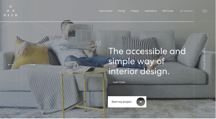
Distracting users is always a concern when it comes to sticky navigation, so what HopDeco does is just take the more important elements of the navbar, while leaving the rest on top.
Notice how the top navbar disappears once you scroll down, leaving the hamburger button on the top right, which when you click, takes over the entire page like so:
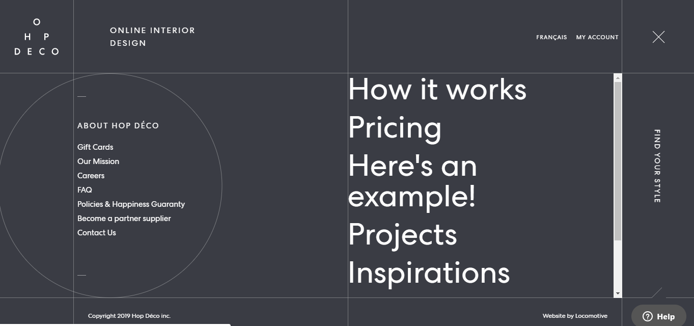
It’s a creative way to keep the design neat, while also cleanly integrating as much information as the user might need whenever they choose to.
Ocean School: Visual Contrast
As you saw in an early example above, color clashing can be tricky when you try to cram in too many elements on a page. Having fixed navigation may be rendered useless when it’s hard for users to even see it.
Ocean School does a good job of creating visual contrast to ensure that everything pops out, even in an extremely visual site.
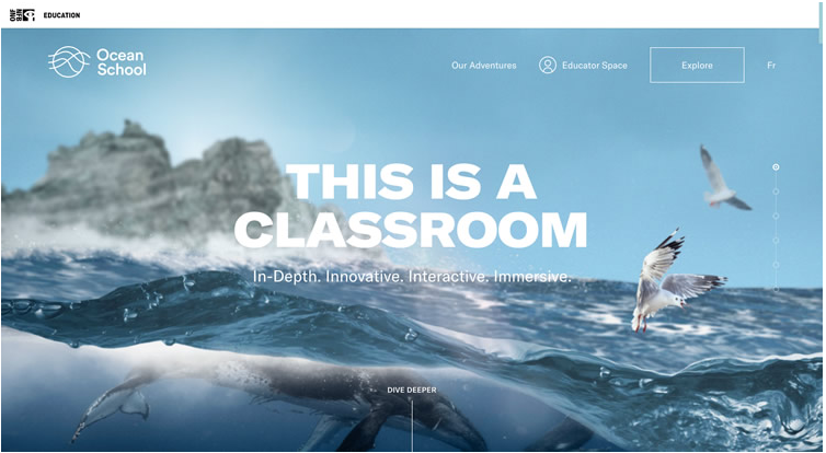
As you can the navbar plays well with the blue background at the very top of the page. To ensure this remains the case even as the visuals change, Ocean School pulls down a white background for their sticky navbar.
This way, whatever image color follows, the navigation remains clear.
Search Engine Journal: Get creative with it
While usability and easy navigation are the main reasons for using sticky navigation, Search Engine Journal (SEJ) shows that you can also get creative with it. On their homepage, you can see their logo embedded in their featured story box.
But as soon as you scroll down, the nav text slides over to the right, while the SEJ logo animates into view.
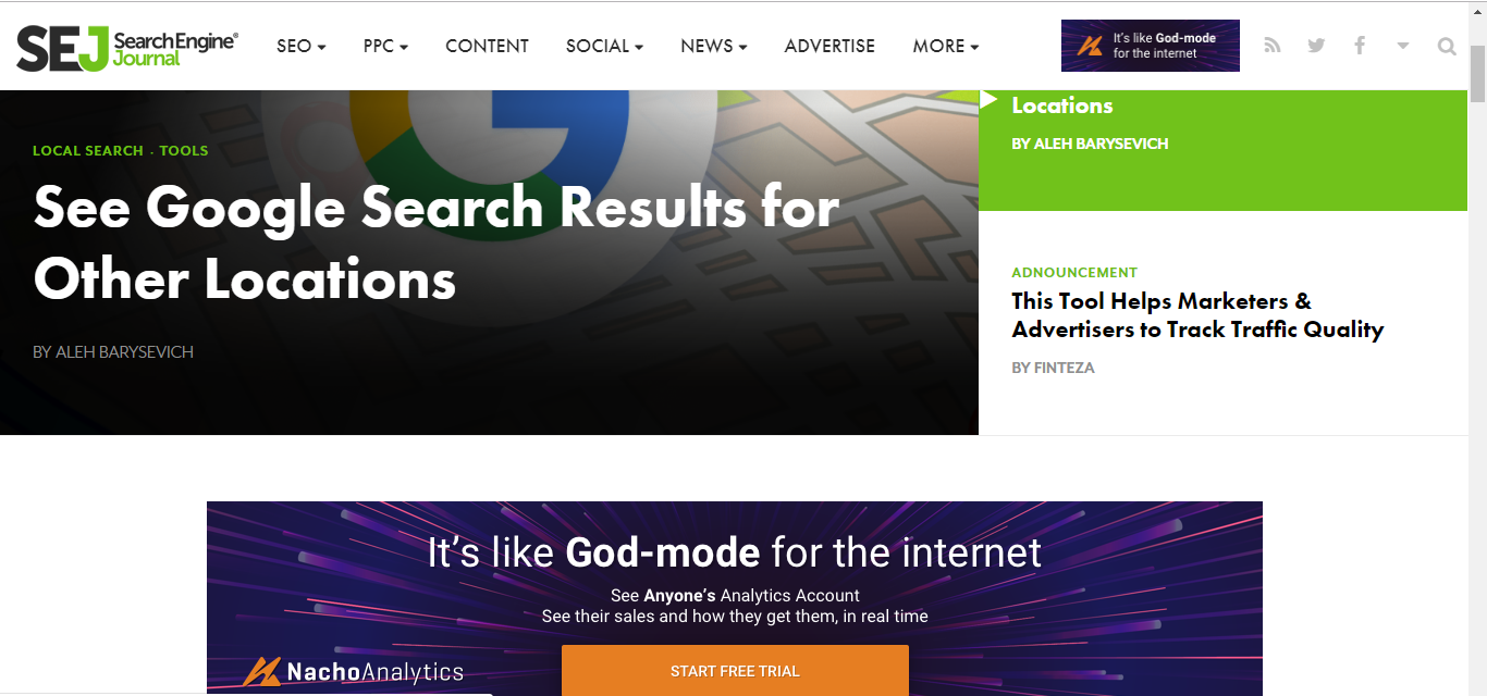
Particularly for a magazine-style website, it’s a cool feature to throw in – and one that really stands out.
Do you need sticky navigation on your site?
Sticky origins
An excellent way to figure out if you should go the sticky navigation route is to take a step back and look at its origins. In the nascent stages of web design, complex sitemaps were commonplace across the web. With different functionalities and features scattered across multiple pages, it was easy for users to get lost and not find what they were looking for.
The next evolution saw websites being consolidated into as few pages as possible, with some sites taking it to the extreme by putting everything on a single page. But while it made navigation simpler, it also resulted in longer pages and longer scrolling times. So if you wanted to see if you had better options down the page then eventually decide that you already saw what you needed up top, you’d need to scroll back up again.
That wasn’t optimal as you might imagine. So the next solution was navigation that follows you down the page.
The answer: Not quite black and white
The answer, as with a lot of things in this digital age, is not always either this or that. Depending on what type of website you need, you will have to weigh the pros and cons of both sides, sometimes even needing to combine both, depending on certain web pages.
For example, if you’re shooting for an informative, content-heavy page, a fixed header is a good way to make sure your users are never lost and short of options. As well, when it is crystal clear what tools and features are most frequently used by users (as it is with most social media sites), then sticky headers and other elements would be highly recommended.
Additionally, before you just jump on the sticky bandwagon (or any of the top trends), it would be best to get feedback from your users. If there’s a common friction point that’s frequently encountered, and if so, how would sticky navigation address that? What tools, pages, and features are most commonly used on your site? Do you need them on every page?
Find out what the answers to these are, and it’ll most likely tell you whether you need sticky navigation or not.
What sticky elements do you find quite useful? Sound off in the comments section.
Author Bio
Aaron Andre Chichioco is the managing editor of designdoxa.com. He loves to write about online marketing, eCommerce and web design. He has a vast experience in overseeing daily operations of several online businesses since 2011. You can follow Aaron on twitter at @Aaron_Chichioco