This is a guest post by Henry Rise. If you’d like to contribute to our blog, feel free to get in touch with us.
Web design trends matter especially if you are in the web design and development business. And in this post, we are going to discuss the coming trends for WordPress themes.
Trends keep evolving and the companies should align their priorities and goals according to them; search engines update their algorithms, plugins update, features get upgraded – it’s up to you to stay on par.
If you want your site to rank high, convert well, and be a success, you’ll have to adopt leading trends to impress the masses.
This 2019, we’ve sifted through all the leading design trends to come up with our list of 10+ design predictions for WordPress themes, to help you pick out the ones that might work the best for your business.
You need to remember the following – these trends are not supposed to work altogether. Therefore, mix and match them, or pick the right one, based on your business and personal style. Enjoy!
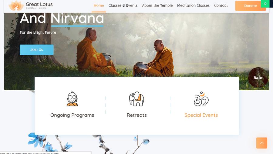
#1. Don’t be afraid to break grid layout
Everybody knows that a grid brings order and organization to website design. It helps create good-looking layouts by keeping all elements aligned. In other words, a grid helps keep each element where it should be.
A broken grid does quite the opposite. It lets you mess the page up using floating elements like text or images and place them almost wherever you wish.
Example: Great Lotus – Buddhist Temple WordPress Theme
Some designers like this trend and some don’t. Let me explain.
A broken grid layout looks fun and is unique. But many sites just don’t seem ready to handle it. If you are just starting out and decide to use this trend, you may simply lack the knowledge to make it work in your favor.
Let’s suppose you’ve chosen a WordPress theme featuring a broken grid layout. You need to make sure your page loads quickly and you need to take care of it functioning properly on a mobile site.
When not used properly or overused, the broken grid makes the page structure and content difficult to comprehend.
If you are not sure that you are skillful enough, just leave the broken grid to professionals. But if you want to use it no matter what, try to get an extra pair of eyes to take a look at your website’s experience.
#2. Minimalism, again
Minimalism is not a new trend. It has been around for a while. The trend is well-known especially when it comes to website design. With more and more new complicated features coming in, sometimes it’s a great solution to keep things simple.
Example: eLumine – The Learning Experience Theme

Thus, making your site minimal is one of the website design trends for 2019. Each and every element of your website needs to have a clear purpose. The text must be legible and easy to read. You may use a few images or not use them at all.
This trend is for daring designers/site owners because it’s not that easy to keep your site minimal, yet bold and effective at the same time.
You need to clearly understand what is your brand’s message and what you are aiming at with your site.
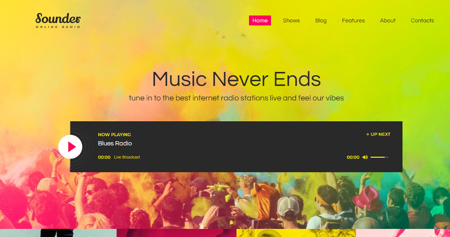
#3. Go bright
If minimalism is not for you, opt for another outstanding trend. Catch the eye of the user with bright colors!
Example: Sounder – Online Radio WordPress Theme
Just a thought, you can combine minimalism and bright colors to make your website absolutely marvelous.
Using bright, brand-aligned colors is a great way to draw the attention, deliver your message, and make people remember you.
But it’s important to remember that your colors of choice should be elegant and should reflect your brand. You must have a plan on how they will match together because the worst thing to do is combine all the colors randomly.
As a rule, it is not recommended to use more than 3 colors on one site. But if you know what you are doing, this number can be increased (Google, anybody?!).
You should also understand that the trend doesn’t work similarly for each and every site. Sometimes websites look better, sometimes not.
For instance, if you have a portfolio site, bright colors will help you express yourself, show your creativity; whereas for a blog, they can be distractive, bright colors might lead the reader away from the important content.
#4. Use illustrations
It’s a wonderful idea to use sleek and modern illustrations.
Example: Gutentype – A Trendy Gutenberg WordPress Theme
If you manage to create unique, brand-aligned icons/illustrations, your site will definitely differ from any competitors. This is an excellent way to stand out and an effective method to create an easy to understand layout with a great user-friendly interface.
If you are going to follow this trend, make sure not to use stock icons/illustrations. They will make your site look cheap and boring.
It’s not easy to find a theme with ready to use illustrations, but we don’t say that it’s impossible. Just be picky while doing your research.
#5. Big & bold typography
Use great typography as another way to tell your audience your specific story in a unique manner.
Example: Twenty øne Piløts – Banditø
Sometimes your choice is limited to a bunch of basic fonts by theme creators. That is why it’s important to research a theme and a platform that’ll power it.
Unique fonts come along with minimalism and boldness. Though, they need to be brand aligned, easy to read, and responsive.
We should say it once again – don’t overdo with the bold typography. Use it for headlines and other accents on the page you would like to highlight. Less is more here. The point is that unique typography will lose its effectiveness if you overuse it.
#6. Tell your story with the help of a video header
You must’ve surely noticed that video is becoming more and more popular on various social media. The same tendency continues to evolve in website design.
Example: Corn Studio
When following this trend there are some things you need to keep in mind. Adding a video header could make a huge effect on your site but might limit its usability.
First of all, if you are using a video, it must be of high quality. It also must be relevant and professionally created. Adding a video just because you think it might look cool is not the best idea unless you have a strong brand strategy related to this media.
You should also make sure your site doesn’t slow down. With a video, the site load time could increase, or it might even crash for some users, say, for the ones who don’t have the necessary browser features to view the video.
But if implemented correctly, a video can add a personal touch, and spark an instant willingness in your users to know more about your company or even make a purchase.
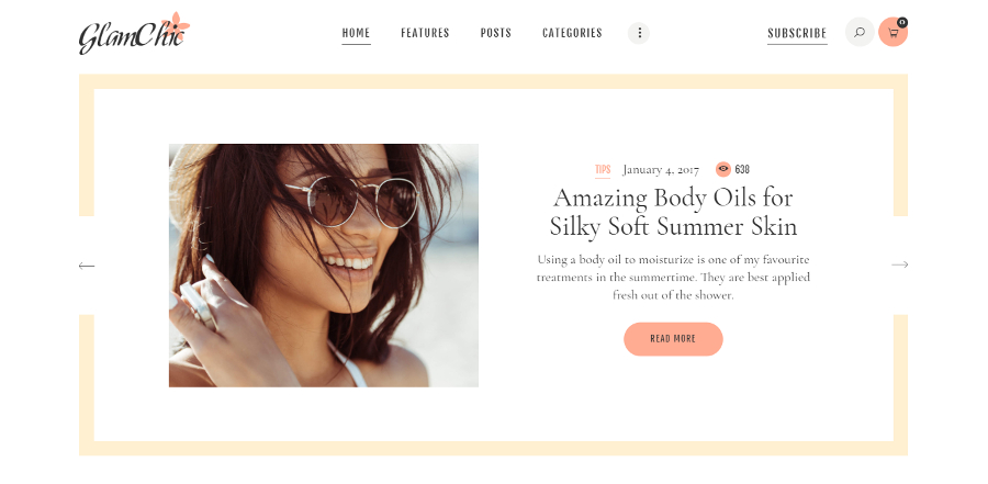
#7. Light design
The trend is similar to minimalism but is a bit more versatile. By lightness, we mean using sophisticated simple colors, thin fonts, light images. The style is especially popular among bloggers in the fashion and lifestyle fields.
Example: GlamChic – Beauty Blog & Online Magazine WP Theme
Light websites look elegant. No doubt. This style is a good fit for many businesses and if you decided to create a site based on this trend, do make sure that all of its parts are functional and easy to understand.
Light sites often use tender, pastel hues as their accent color. It may be light gray or pink, for example. But if you’re thinking an accent color is used to make a call-to-action standout, you wouldn’t be wrong in worrying about all people missing them altogether. The key is to add pastel hues in the right place.
Although you won’t find tons of WordPress themes to choose from when it comes to this trend, it can also mean this trend could make you completely unique.
While this list above comprises of primary trends, secondary ones include:
#8. Mobile friendly design
Always make sure that the WordPress theme you choose is responsive and works well both on desktop computers & mobile gadgets.
#9. Whitespace
Don’t forget to keep the balance of whitespace. Leave enough of it to make your site easier to read and improve the layout flow.
#10. Users-first design
Your site must meet user’s expectations and queries. So think well about what your users want to see and make sure that your website caters to their needs.
#11. Effective e-mail popups
Email marketing is a part of every site promotion campaign. How are you going to build up your email list? Think about it on the stage of design. Choose the theme that supports the popups that will help you collect your customers’ emails. Just make sure that they are not too annoying.
Over to You
These trends often influence WordPress design and redesign decisions as brands adapt to evolving user expectations. Did you get a portion of inspiration? We hope so. Is there any essential trend/prediction you would like to add to our list? Please feel free to drop us a line in the comments section.
Cheers!
Author Bio
Henry Rise is the CEO of ThemeRex, and a ThemeForest Power Elite Author. He loves to help people build their business online. Every business begins with the right choice of a micro-niche WP Theme.