| Premium website design is rarely about trends, animations, or expensive visuals. Most high-performing brands feel “premium” because they make a small number of deliberate design decisions that generic websites skip.
In this guide, you’ll learn the 7 highest-impact decisions that separate premium websites from template-looking ones, from typography and color systems to hero hierarchy, imagery, components, and brand design systems. |

Premium website design isn’t about following trends or adding more animations. At the $1M+ stage, the difference between a site that feels credible and one that feels interchangeable usually comes down to a handful of deliberate design decisions, most brands never make them.
Try this for a moment: open your website in one tab and three competitors in the next. Now scroll quickly. If everything starts blending together, similar layouts, identical hero sections, the same stock-feeling visual rhythm, you’re not imagining it.
This happens more often than founders expect. The issue usually isn’t the business, the positioning, or even the budget. It’s that key visual decisions were never intentionally made because the template, theme, or “best practice” made them for you.
This is also why many website redesigns fail to create meaningful visual differentiation. A website redesign only works when it fixes the decisions underneath, not just the surface.
We see this constantly at WisdmLabs. Founders come to us after investing in redesigns that technically look “good” but still feel indistinguishable from the category. The question is usually the same:
“Why does our site still look like everyone else’s?”
The answer almost always comes down to a small number of overlooked design decisions that shape how premium, differentiated, and trustworthy a brand feels online.
In this piece, we break down the seven decisions that separate premium websites from template-looking ones, in priority order.
Why most websites end up looking interchangeable
The “sameness” problem isn’t new. But it’s worse than it’s been.
A widely discussed Hacker News thread titled The Unbearable Sameness of the modern web, and hundreds of commenters chimed in with the same observation. Three sites in a category, side by side, and they could all be the same brand.
There are three reasons this happens, and they tend to reinforce each other.
1. Everyone starts from the same foundation
A surprisingly large share of the web runs on the same handful of WordPress themes: Astra, Divi, Elementor presets, Kadence, and GeneratePress. They’re solid products. The problem is what happens next.
When three competitors start with the same theme and mostly accept its defaults, those competitors start looking like variations of the same website. Different logo. Same visual language.
2. Page builders reward sameness
Most page builders come pre-loaded with the same hero sections, testimonial layouts, pricing cards, and CTA blocks.
A founder picks the one that “looks clean” and launches. Three months later, two competitors make the exact same decision. Suddenly, everyone has the same centered headline, image-right section, and three-card pricing grid.
3. Nobody made the actual brand decisions
This is the biggest one.
The website may be polished, but nobody intentionally decided:
- What should feel unmistakably ours?
- What visual cues should signal premium positioning?
- What should make us instantly recognisable in our category?
As one B2B design essay on LinkedIn put it:
“When your firm’s content uses the same layouts, the same icon styles, and the same colour-blocked text cards as every other firm in your category, you are not building a brand.”
The fix isn’t a new theme. It’s seven specific decisions that nobody else in your category is making with intent. We’ve covered some of the common pitfalls in our 7 WordPress design and development mistakes guide if you want the broader landscape first.
What “premium website design” actually means (and what it doesn’t)
Premium website design is a coherent set of visual decisions that work together to make a brand feel decided, considered, and distinct. It isn’t expensive typography. It isn’t a parallax effect. It’s the absence of accidents.
Visual design carries more weight than founders often realise. The Stanford Web Credibility Project, based on research with over 4,500 people, found that 46.1% of consumers assess a site’s credibility on visual design alone. More than the content itself. And users form that judgement in about 50 milliseconds, per the 2026 web design statistics report.
That window is tiny. Which is why the decisions below matter, and why getting them wrong costs more than people think.
What premium website design is not: a luxury aesthetic. Black, gold, serif headlines, generous margins. That’s one design language, and it suits jewellery and fashion brands. A premium-feeling site for a SaaS tool, a B2B service, or a course business looks completely different. The word “premium” is about coherence and intent. Not vibe.
The seven decisions below are ordered by impact-to-effort ratio. The earlier ones do more work for less money.
1. Typography: the fastest signal of premium website design
Typography is one of the highest-leverage changes you can make to a website. It is also one of the first things users register, often before they consciously read a single word.
When a site feels premium, intentional, and trustworthy, typography is usually doing more of the work than people realize.
The template tells
Most websites rely on default theme typography: Open Sans, Roboto, or Lato, paired with default sizing (16px body text, 32px headlines) and little intentional hierarchy.
Nothing feels wrong. It just feels familiar.
The result is a site that looks “fine” but indistinguishable from dozens of others in the category. Headlines and body copy feel like they are speaking in the same voice, just at different volumes.
What actually makes typography feel premium
Premium brands tend to feel visually decided.

A strong type system usually includes:
- A display font with personality for headlines
- A body font optimized for readability
- Intentional spacing and size differences that create rhythm and hierarchy
When typography feels selected instead of inherited, visitors subconsciously register that someone made a deliberate choice. That perception of intentionality is often what reads as premium.
What this looks like in practice
- Pick two typefaces, not three. One for display, one for body copy is usually enough.
- Choose fonts with character. Options like Inter, Geist, Söhne, GT America, Editorial New, or Tiempos create a noticeably different impression than default theme fonts, and many have free or affordable licensing options.
- Create a deliberate type scale. Body text at 17–18px usually feels more premium and readable than 14–16px. Desktop H1s in the 48–64px range create hierarchy you can feel immediately.
One cost most advice ignores
Licensed web fonts can cost anywhere from $50 to several hundred dollars annually, depending on usage rights and traffic volume. They also need a fallback strategy for loading speed and performance.
Most “just use better fonts” advice skips this reality. Plan for it up front.
| What we typically uncover in a redesign audit.
On a recent edtech redesign, the client had invested in a strong illustration system and a polished logo, but the live site still felt generic. The audit found one cause sitting underneath everything: the body font was still the WordPress theme default. Swapping it for a deliberately chosen display-plus-body pairing, sized at 17px body and a 56px desktop H1, was the single change that made early test viewers describe the site as “feeling more expensive.” Nothing else on the page had moved yet. |
2. Color: a system, not a palette picker
Color is one of the fastest ways to signal brand maturity. Done well, it creates clarity, confidence, and recognition. Done poorly, it makes even a strong business feel visually noisy.
When founders describe a website as feeling “expensive” or “premium,” restraint is often doing more of the work than they realize.

The template tells
Most template-driven sites use too many colors with too much visual equality.
You see:
- Five to seven colors competing across the interface
- Theme presets with a vivid primary blue and equally loud secondary orange
- Buttons, icons, headings, cards, and background blocks all competing for attention
Nothing feels intentionally prioritized.
The result is visual noise. Instead of guiding the eye, every element asks to be noticed at the same time.
What actually makes a color system feel premium
Premium brands tend to feel visually restrained.
A strong color system signals confidence because it knows when not to ask for attention.
In practice, this usually means:
- One primary brand color used intentionally
- One or two neutrals carrying most of the interface
- One supporting accent color for secondary interactions
When color feels deliberate rather than decorative, the brand appears more established, focused, and trustworthy.
What this looks like in practice

A working color system usually follows a simple structure:
- One brand color → used sparingly, mainly for primary CTAs and a few key accents per page
- One or two neutrals → warm greys, off-whites, or deep charcoals that carry most of the visual weight
- One supporting color → reserved for secondary actions, links, states, or subtle accents
A useful rule of thumb:
Neutrals should carry roughly 90% of the interface. Brand color should occupy the remaining 10%.
That proportion is often what creates the calm, intentional feeling founders interpret as premium.
Where brand systems actually begin
This is also where a real brand design system starts to take shape.
Typography gives a brand its voice. Color gives it consistency.
Most websites feel generic not because the colors are wrong, but because no one decided what role each color should play.
3. Spacing and rhythm: where templates always cheat
Generous, intentional spacing tells users what matters. Cramped layouts make everything feel equally important, which usually means nothing stands out at all.
When a website feels calm, premium, and easy to move through, spacing is often doing invisible work in the background.

The template tells
Most template-based sites rely on uniform spacing everywhere.
You see:
- The same padding repeated section after section
- Cards stacked tightly to “fit more” on the page
- Captions pressed too close to images
- Homepages that feel visually crowded the moment they load
Nothing has room to breathe.
The result is a site that feels busy, even when the content itself is strong. Instead of guiding attention, every section competes equally for it.
What actually makes spacing feel premium
Premium websites use space as a signal.
Spacing is not an empty design. It is a hierarchy.
Research from the Nielsen Norman Group consistently shows that users scan content rather than read it line by line. Visual patterns, spacing, and hierarchy heavily influence where attention goes first.
Elements with more space around them naturally attract more attention, often disproportionate to their actual size.
That means spacing is not decorative. It is directional.
What this looks like in practice
Strong websites create layout rhythm, not uniformity.
Different sections get different amounts of space based on importance:
- Hero sections → the most breathing room
- Feature or product sections → slightly tighter spacing
- Testimonials or supporting proof → tighter still
- Footers and utility sections → compact and functional
The variation is what creates pace.
Without rhythm, a homepage feels like content was stacked. With rhythm, it feels intentionally designed.
A quick self-check
Open your homepage and scroll from top to bottom.
If every section has roughly the same spacing, your site is probably following the template’s defaults instead of communicating hierarchy.
Premium websites rarely feel “full.” They feel edited.
If you want a second opinion on whether your homepage is actually spaced well, our Design & UI Bot gives a quick read on spacing, hierarchy, and visual flow. It takes about two minutes.
| Case in point: the LMS unification we ran for Bilinguistics.
The original setup had two separate learning experiences stitched onto one homepage, with every section fighting for equal visual weight. Consolidating onto a single LearnDash-based system gave us permission to rebuild with hierarchy in mind: fewer competing sections, deliberately different vertical spacing for hero, programmes, and proof. The downstream effect was operational, not just visual — support tickets dropped 73% as learners stopped getting lost in the navigation, and reported learner satisfaction rose 30%. |
4. Hero hierarchy: one focal point, not three
The hero section is where most websites either establish confidence or create confusion, often before the visitor scrolls even once.
When a site feels instantly credible, the hero is usually doing one thing exceptionally well: making it obvious what matters.

The template tells
Most websites try to make the hero do everything at once.
You see:
- A headline
- A subheadline
- A primary CTA and secondary CTA
- A customer logo strip
- A product screenshot or stock image
- A badge, announcement bar, or trust signal
- A chat widget appearing instantly
Everything competes for attention.
The visitor’s eye moves around the screen without knowing where to land. Instead of clarity, the first impression becomes cognitive overload.
What actually makes a hero section feel premium
Premium hero sections are focused.
A clear hero forces a brand to make a decision about positioning.
When the message is unclear, websites compensate by adding more elements. More buttons. More proof. More explanations.
But when positioning is clear, the hero becomes simpler because it only needs to do one job well.
A premium website trusts its strongest message enough not to compete with itself.

What this looks like in practice
A high-performing hero section usually includes:
- One headline → focused on a clear outcome, not a feature list or vague tagline
- One supporting sentence → brief context, usually one sentence
- One primary CTA → the main next step you want visitors to take
- One supporting visual → product image, interface preview, or brand-led visual
That’s usually enough.
Additional trust elements like customer logos, secondary CTAs, FAQs, or supporting proof can move lower on the page where they reinforce the message instead of competing with it.
The hero earns its space by doing one job clearly.
A quick self-check
Open your homepage and look at it for five seconds.
Can someone immediately answer:
- What do you do?
- Who is it for?
- What should they do next?
If not, the issue is usually not copy length or design polish.
It is clarity.
If the hero matters that much, and it does affect conversion, a quick read on what’s hurting it can help. Our Conversion Rate Audit Tool flags where attention is leaking on your homepage in roughly two minutes.
| From our work: the Tao of Tea rebuild.
When we rebuilt Tao of Tea on WooCommerce, the brand needed to serve two audiences (retail buyers and wholesale accounts) without making either feel like an afterthought. The temptation was a hero with two parallel CTAs of equal weight. We resisted it. The retail flow got the foreground — one headline, one image, one button. The wholesale entry sat quietly in the secondary navigation. Two paths. Only one in the foreground at any given time. The result: a hero that felt decided, not diplomatic. |
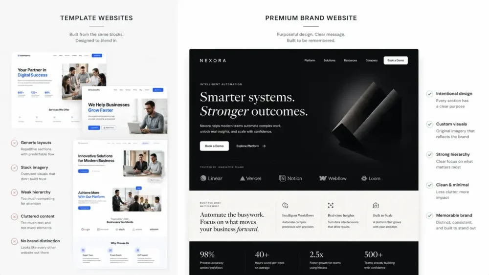
5. Imagery: custom over stock, every time
Imagery is often the fastest visual cue that tells visitors whether a website feels premium, credible, and real, or instantly forgettable.
And nothing makes a website feel more interchangeable than generic stock photography.

The template tells
Most template-driven websites rely on the same visual shortcuts.
You see:
- Smiling teams gathered around laptops
- Handshakes in glass offices
- Diverse hands stacked over a meeting table
- Someone pointing confidently at a chart
The problem is not that these images are bad.
The problem is that visitors have seen them hundreds of times before.
When competitors buy from the same stock libraries, entire categories start looking visually identical.
The site may be polished, but it stops feeling specific.
What actually makes imagery feel premium
Premium brands feel real before they feel polished.
Strong imagery signals:
- There is a real product
- A real team exists behind it
- Real customers interact with it
- Real work is happening
That is why even slightly imperfect custom photography often outperforms flawless stock images in terms of trust and credibility.
Visitors rarely say:
“This looks like stock photography.”
They simply register the feeling:
“This feels generic.”
What this looks like in practice
You do not need a massive production budget to improve imagery.
Practical options include:
- A half-day shoot with a local photographer → product shots, workspace imagery, leadership photos, or team interactions (often $800–$2,500 depending on market and scope)
- Custom illustration → commissioned visuals or AI-assisted illustration systems used consistently across the brand
- Heavily art-directed stock imagery → edited, recolored, cropped, and treated to feel unmistakably on-brand rather than generic
- Real product screenshots → shown prominently and intentionally instead of hidden as tiny decorative elements
The consistency rule most brands miss
Choose one dominant visual direction and stay consistent.
- Photography
- Illustration
- 3D render systems
Mixing all three usually makes a site feel assembled instead of designed.
Premium brands tend to look visually coherent because they make fewer imagery decisions more intentionally.
A quick self-check
Look at your homepage and ask:
Could this exact imagery appear on three competitor websites without anyone noticing?
If the answer is yes, the issue is probably not design quality.
It is distinctiveness.
| What we typically replace in a redesign.
The single most common imagery upgrade we make on a redesign isn’t expensive: it’s removing stock photography of “smiling teams around laptops” and replacing it with three or four real assets the client already owns and didn’t think to use. Real product screenshots. A photograph from a recent customer event. A diagram drawn for an internal training deck. Visitors register the difference immediately, even when they can’t name what changed. |
6. Components: buttons, cards, and forms that match the rest of you
Brand is not built only through logos, typography, or color.
It becomes visible in the smallest moments: a button click, a card hover, a form interaction, a menu transition.
These details may seem minor individually, but together they determine whether a website feels intentionally branded or quietly generic.

The template tells
Most websites rely on default component styles inherited from themes or page builders.
You see:
- Pill-shaped buttons with generic gradients
- Cards using the same rounded corners and shadows as countless other websites
- Forms that feel copied from standard UI kits
- Hover states that are inconsistent, overly animated, or missing entirely
Nothing looks obviously wrong.
It just feels familiar.
The result is a website that may look polished at first glance but loses distinctiveness the moment someone starts interacting with it.
What actually makes interaction design feel premium
Premium brands feel coherent at every level of interaction.
A logo and homepage can look perfectly on-brand while the buttons, cards, and forms quietly communicate something else. Visitors notice the inconsistency, even if they cannot explain why.
This is where branding becomes operational.
Strong component systems make the website feel unmistakably consistent because every interaction follows the same visual logic.
That level of cohesion is often what separates custom website design from heavily customized templates.
What this looks like in practice
A few component-level decisions shape how the entire site feels:
- Button shape and visual weight → square, rounded, or pill-shaped buttons each communicate a different personality; filled and outlined styles signal different levels of confidence and emphasis
- Card treatment → hard edges versus soft corners, flat layouts versus elevated shadows, borders versus no borders all create different brand impressions
- Form styling → underlined versus boxed fields, floating versus static labels, and focus-state colors influence perceived polish and usability
- Hover and motion rules → subtle scaling, color shifts, or no animation at all can work, but consistency matters more than novelty
The goal is not adding more effects.
The goal is making interactions feel like they came from the same brand system.
A quick self-check
Open three pages on your site.
Do buttons, forms, cards, and interactions feel like they belong to the same design language, or do they feel like they came from different plugins and templates?
Premium websites usually feel consistent in ways users never consciously notice.
Generic websites feel stitched together.
When templates start fighting the brand
This is often the moment founders hit the limit of theme customization.
If core components become difficult to control consistently, it may be a signal that the site has outgrown template adjustments and needs a more intentional design system or custom WordPress development to maintain coherence at scale.
7. A brand design system: the thing that holds it all together
A premium website is not just well-designed on launch day. It stays coherent as new pages, campaigns, and content get added over time.
That consistency rarely happens by accident.
A brand design system is what makes everything new feel like it always belonged there. It is often the difference between a website that looks designed and one that feels like a mature brand.

The template tells
Most websites are designed page by page, not system by system.
You see:
- A pricing page with a different button style than the homepage
- Blog headers using different typography scales
- Section spacing changing unpredictably
- New landing pages added six months later that feel visually disconnected from the original site
Nothing feels obviously broken.
It just feels inconsistent.
The result is subtle brand drift. Over time, the site starts feeling like a collection of decisions instead of a unified experience.
What actually makes a brand feel premium
Premium brands are consistent without feeling repetitive.
A strong design system allows a brand to scale without reinventing itself every time a new page gets built.
This does not mean creating a massive 100-page design manual.
In practice, most growing brands only need:
- Documented design tokens → typography, color, spacing, and sizing rules
- A small library of reusable components → buttons, cards, forms, navigation, content blocks
- Clear rules for consistency → what stays fixed and when exceptions are allowed
When everyone builds from the same system, design decisions stop becoming debates.
What this looks like in practice
For most growing businesses, a minimum viable design system is surprisingly lightweight:
- A one-page reference document for typography, colors, and spacing rules
- Five to ten reusable components clearly defined (buttons, cards, forms, navigation, footer, content sections)
- A short rulebook for exceptions, because occasionally breaking consistency on purpose is still consistency
The goal is not rigidity.
The goal is to reduce unnecessary decision-making so the brand stays recognizable as the site evolves.
Why this matters more than founders expect
Design systems often sound abstract until the second or third new page gets built.
That is usually when teams realize they have spent twenty minutes debating button sizes, heading styles, or spacing decisions that should have already been solved.
A good design system pays for itself the first time it ends an argument.
The brands that feel premium online are rarely making more design decisions than everyone else.
They are simply making fewer decisions repeatedly and more intentionally.
| How we build the system in practice.
When we set up a brand design system for a growing course business, the document itself is rarely the deliverable that earns its keep. The real outcome is the second and third page built six months later by a different team member, and the fact that those pages feel like they always belonged. We build the system as a working Figma component library tied to design tokens inside the WordPress theme, so changes propagate without manual rework. The agency leaves. The system stays. |
| Premium website design self-assessment: rate your homepage A quick read on where you stand. Answer Yes or No. 1. Does your headline font and body font look like they were chosen as a pair, not picked off a default list? 2. Can you state your color palette in three colors with defined roles (primary, neutral, accent), without checking? 3. Does your homepage have visibly different vertical spacing between different kinds of sections? 4. Does your hero section have exactly one primary CTA and one main message? 5. Is the photography or imagery on your homepage either custom or treated, not bare stock? 6. Do your buttons, cards, and form fields look like they belong to the same family across every page? 7. Do you have a documented set of brand rules (color, type, spacing) that a new designer could follow? Score 6–7: Your site is already operating at the premium end. Refinement, not rebuild. Score 3–5: You’re missing two or three high-signal decisions. A targeted redesign of the homepage and key pages would close the gap. Score 0–2: Your site is reading as templated to most visitors, regardless of your business quality. A full redesign is the right call. Our premium website design audit starts free and flags exactly which of these decisions are pulling you down. |
FAQ
How much does a premium website design actually cost in 2026?
A genuine custom website design from an experienced team usually lands between $8,000 and $40,000 for a small-to-mid business, depending on page count, custom functionality, and whether a brand design system is part of the scope. Below that, you’re usually getting a customised template. Above it, you’re typically in mid-market or enterprise territory.
Can I make my templated WordPress site look premium without a full rebuild?
Yes, for two of the three highest-impact decisions. Typography and color can be changed inside most modern WordPress themes, and the perceived lift is significant. Spacing and hierarchy are harder, because most themes restrict layout control. At WisdmLabs we often start there: a partial rebuild of the homepage and key landing pages, before any larger redesign.
What’s the difference between a brand design system and a style guide?
A style guide tells you what your logo and colors look like. A brand design system tells you how those choices get applied across components, layouts, and interactions, with tokens that engineers can use directly in code. The first is a PDF. The second is a working tool. For a growing business, the system is what scales.
Are website design trends like bento grids and brutalism worth following?
Use trends as vocabulary, not as identity. Bento grids and tactile brutalism are useful website design ideas when they fit the brand’s tone, and a liability when they don’t. The risk with chasing trends: the trend itself becomes the next templated look. Lean on website design trends sparingly, only where they amplify something already true about your brand.
How long does a custom website design project usually take?
For a small-to-mid business with a defined scope, six to twelve weeks is the realistic range from kickoff to launch. Faster than that usually means a customised template rather than custom design. Slower than that usually means scope expansion or unclear decision-making on the client side, which is the most common cause of delays.
The version of your site that doesn’t look like everyone else’s
The seven decisions above aren’t a checklist of trends. They’re a set of choices that, made deliberately, separate brands that look interchangeable from brands that feel unmistakably like themselves. Templates often make these choices for you. Strong design happens when those choices become intentional.
If you recognised your own site in more than a couple of the template tells, that’s usually not a problem of taste or effort. More often, it’s a handful of design decisions that were never fully defined.
The good news is that most of them are fixable, and not always through a full rebuild. In many cases, a few high-leverage changes create a disproportionate shift in how the brand is perceived.
The harder part is usually figuring out which decisions actually matter for your business, and which are just aesthetic distractions. A B2B service site, a SaaS company, and an edtech brand won’t all need the same fixes, or in the same order.
If you’re at the stage where you want a clearer read on what is making your site feel more templated than premium, here’s how we at WisdmLabs typically approach it:
| 1. A 30-minute call. No deck, no pitch. We look at your site, your competitors, and what’s actually working against you visually.
2. A clear scope. We tell you which of the seven decisions matter most for your business, what the work involves, how long it takes, and what it costs. In plain language, before anything starts. 3. We design and build it. Our team handles the design system, the WordPress build, and the launch. You’re involved where your input matters, not dragged into every choice. 4. You review, we launch. Nothing goes live until you’ve signed off.5. You own it. Everything is documented and handed over. The brand design system stays with your team. |