Most subscription and membership businesses spend the majority of their design and optimization budget on acquisition and sign-up.
The homepage gets redesigned. The checkout flow gets tested. The onboarding experience gets refined.
But three pages are usually left exactly as the platform provides them:
- The Renewal Page
- The Account Management Page
- The Cancellation Flow
They’re treated as separate screens rather than parts of a connected post-purchase experience.
Yet these are the pages customers interact with when deciding whether to renew, modify, pause, or cancel their subscription.
| Page | What Most Businesses Do |
| Renewal Page | Use the default renewal experience provided by the platform |
| Account Management Page | Leave subscribers with a standard billing portal |
| Cancellation Flow | Focus on processing cancellations rather than understanding or preventing them |
Individually, each page may seem like a minor touchpoint.
Together, they form a post-purchase design system that directly influences retention, customer satisfaction, and long-term subscriber value. For growing subscription businesses, it is often one of the most overlooked opportunities to reduce subscription churn without changing the product, pricing, or acquisition strategy.
What makes this redesign interesting is that we didn’t optimize these pages in isolation. We treated the renewal page, account management screen, and cancellation flow as interconnected parts of the same subscriber journey.
In this article, we’ll walk through what changed, why we redesigned these experiences as a system rather than individual pages, and what happened to subscriber behavior and retention after the redesign.
The three post-purchase pages behind the leak
Every subscription business has these three pages. Most built them at launch using platform defaults and never touched them again.
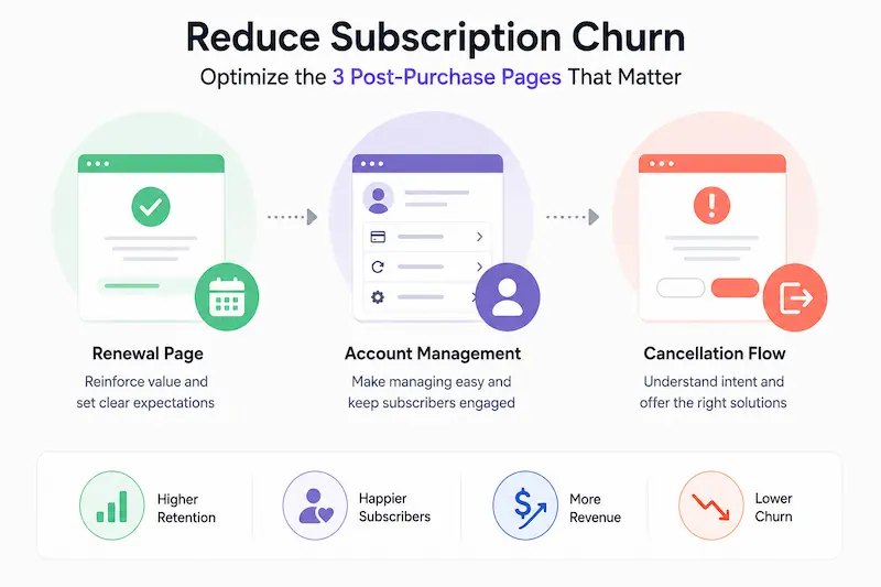
The renewal page handles the moment a subscription auto-renews. Most businesses manage this with a stock notification email. A deliberately designed renewal page confirms value, surfaces plan options, and reduces the “is this still worth paying for?” reaction before it becomes a cancellation request. For many businesses, improving the renewal experience is one of the fastest ways to reduce subscription churn caused by preventable cancellations and failed renewals.
The account management screen is where subscribers go to manage their plan, update billing, and — if they’re considering leaving — look for an alternative to cancellation. Most account screens are billing portals. A well-designed one is a retention surface.
The cancellation flow is the final moment before a subscriber leaves. Most businesses treat it as a last-ditch retention mechanism. Its real job is to acknowledge the cancellation cleanly, gather one piece of insight, and offer one relevant save — then confirm quickly if they still want to go.
Together, these three pages govern every high-stakes subscriber moment after the first payment. Designing them as a connected system is where meaningful subscription retention improvement happens.
The renewal page — your highest-stakes page, designed by default
Most subscription businesses treat renewal as a backend event. The subscriber is charged, a receipt goes out, and the system moves on. Nobody designed the renewal experience. It just happened.
The renewal moment is when a subscriber consciously decides whether this is still worth paying for. If your renewal page doesn’t answer that question, you’re leaving the answer to chance.
We have worked with subscription businesses where the first thing a subscriber heard about their annual renewal was a charge notification from their bank — no email, no reminder, no summary of what they’d received during the year. That’s not just poor design. That’s the trigger for disputes and reactive cancellations that could have been avoided entirely.
What most renewal pages look like
A generic “Your subscription has been renewed” email. No value summary. No plan options. No framing of what the next period includes.
The subscriber gets a charge they half-forgot was coming, feels momentarily resentful, and either lets it go or opens a cancellation tab. The split is close to random — because the renewal page gave them nothing to make a considered decision.
What a redesigned renewal page does differently
A well-designed renewal page does three things:
- Delivers a value summary for the period that’s ending, whether that’s sessions used, content accessed, orders placed, or another meaningful metric.
- Surfaces plan options such as pause, downgrade, or upgrade before the charge lands, not after.
- Makes payment updates frictionless, reducing the chance that subscribers lose access due to an avoidable billing issue.
The intended outcome is fewer billing surprises, fewer reactive cancellations, and a lower likelihood of involuntary churn caused by avoidable payment failures.
For a concrete example: our subscription payment fix for MollyMy restored a 100% renewal success rate in 30 hours by addressing exactly this gap — the renewal flow had no retry logic and no subscriber-facing recovery path.

Subscribers were failing to renew not because they wanted to cancel, but because the renewal page gave them no way to fix a failed payment before the subscription lapsed.
As our guide to the membership website renewal funnel explains, passive churn — where members lapse because they can’t update billing details in time — often looks like voluntary cancellation in the data. It isn’t.
| Before investing in renewal flow redesign, it’s worth understanding where subscribers are encountering friction. Conversion Rate Audit Tool can help identify issues across the subscriber journey, including renewal touchpoints, billing flows, and self-service experiences that may be contributing to churn.
Tools for renewal page redesign Paddle Retain and Churn Buster handle dunning logic and renewal flow optimization. ProfitWell Retain provides recovery playbooks based on subscriber payment history. |
The account management screen — where churners tell you they’re leaving
Most account screens are a billing portal with a password reset option. Subscribers go there to update a card or change an address. That’s about it.
But the account management screen is a behavioral dashboard. Every action a subscriber takes on this page in the 30 days before they cancel is a signal — and most subscription businesses never read those signals.
Payment method removals. Repeated billing history visits. Downgrade attempts that stall because the option isn’t visible. These are churn signals, and without a deliberate account screen design, there’s nothing on the page to intercept the intent.
At WisdmLabs, we reviewed subscriber data for a client after a redesign audit and found that 68% of their churned subscribers had visited the billing section of their account screen more than three times in the 30 days before cancelling. Nobody had flagged those visits as a high-risk signal. There was nothing on the page designed to respond to them.
The signals most account screens miss
A subscriber who visits the billing page three times in a month is looking for something: a way to pause, a way to downgrade, a number to call about a dispute. If your account screen doesn’t surface those options, the next stop is the cancel flow.
Our complete guide to retention marketing on WooCommerce covers how behavioural signals on the account page feed into broader retention workflows — and why treating the account screen as a passive billing page misses most of the signal.
What a redesigned account screen surfaces
A well-designed account management screen surfaces the information and actions subscribers are most likely to need:
- Usage or value data from the current billing period
- Clearly accessible pause, downgrade, and upgrade options
- Proactive payment update prompts before cards expire
- Fast access to support for billing questions or account concerns
The goal is to give undecided subscribers a visible path that isn’t cancellation.
| Before redesigning an account management experience, it’s useful to identify where subscribers may be encountering friction. A UX review can reveal issues such as buried plan controls, missing self-service options, unclear billing information, or support pathways that are difficult to find.
Our Design & UI Bot provides a quick way to evaluate account pages against common usability and subscription-management best practices. Tools for account management improvements Baremetrics and ProfitWell provide behavioural analytics overlays that flag at-risk accounts based on account screen activity. WooCommerce Subscriptions handles core plan management; custom logic handles the rest. |
The cancellation flow — the most misunderstood page in subscription design
Most teams treat the cancel flow as a last-ditch retention mechanism. Make it hard enough and some subscribers will give up and stay.
That logic doesn’t hold. And from 2026, it’s also a regulatory problem.
The FTC’s proposed “Click-to-Cancel” rule sought to establish a simple principle: if consumers can sign up online, they should be able to cancel just as easily. However, the rule was vacated by the U.S. Court of Appeals for the Eighth Circuit in July 2025 before it took effect, and its long-term regulatory future remains uncertain.
Even so, subscription businesses should not assume difficult cancellation flows are risk-free. State automatic-renewal laws, FTC enforcement actions, and evolving consumer-protection standards continue to favor transparent, low-friction cancellation experiences.
| ⚖️ Regulatory Update: FTC Click-to-Cancel Rule
The FTC’s proposed Click-to-Cancel Rule was intended to require subscription cancellations to be as easy as sign-ups. However, the rule was vacated by the U.S. Court of Appeals for the Eighth Circuit in July 2025 before taking effect. As of publication, its future remains uncertain. Businesses should continue monitoring federal developments while complying with applicable state automatic-renewal laws and consumer-protection requirements. |
The real job of a cancellation flow is not to stop people from leaving. It’s to understand why they’re leaving, offer one relevant reason to stay, and confirm the cancellation cleanly if they still want to go.
Why friction in the cancel flow backfires
Friction doesn’t retain subscribers. It builds resentment.
Researchers studying dark patterns across subscription services found that:
- Subscribing typically takes 1–2 clicks
- Cancelling requires an average of 6.7 clicks
- Users frequently describe these experiences as frustrating or deceptive
- Friction-heavy cancellation journeys often generate negative reviews and public complaints
The result isn’t better retention. It’s lower trust and long-term brand damage.
The businesses that improve retention most consistently aren’t the ones adding more friction. They’re the ones making it easier to understand cancellation intent and respond with the right alternative before a subscriber leaves.
What the cancellation flow should actually do
A well-designed cancellation flow has two steps and one offer.
Step one: One exit question. Not a survey — one question about why they’re leaving. The answer determines the offer in step two.
Step two: One relevant save offer matched to their reason. If they said “too expensive,” offer a pause or a discounted plan. If they said “not using it enough,” offer a pause or downgrade. If they said “found a better option,” let them go cleanly — with a confirmation that leaves no bad taste.
A well-designed cancellation flow can do more than simply process churn. Industry retention benchmarks suggest that reason-specific offers, pauses, and downgrade paths can save a meaningful share of cancellation attempts while also providing better insight into why customers leave. The exact impact varies significantly by business model, offer strategy, and customer segment.
A subscription client came to us at WisdmLabs after a spike in churn complaints. Their cancel flow had five screens, two interstitial pop-ups, and a live chat requirement before a subscriber could confirm cancellation. Save rate was 4%. We simplified it to two screens and one relevant offer matched to the exit reason. Save rate moved to 14% — and support tickets about cancellation dropped by 60%.
| Before redesigning a cancellation flow, it’s important to understand where subscribers are abandoning the process, accepting save offers, or escalating to support.
A conversion and retention audit can help identify these friction points and reveal opportunities to improve both the subscriber experience and save rates. The WisdmLabs Conversion Rate Audit Tool provides a starting point for evaluating these journeys before investing in a full redesign. Tools for cancellation flow redesign Churnkey, ProsperStack, and Churn Buster all provide managed cancel flow solutions with save offer logic and analytics built in. |
Quick assessment — which of these pages is costing you the most?
Answer these three questions. Each yes maps to a specific next action.
| Q1: Has your renewal page been deliberately designed since launch — or does it still send a stock platform email?
If it’s still stock: prioritise renewal page redesign first. Start with a value summary in the renewal email. Then surface plan options (pause, downgrade, upgrade) before the charge lands. Add payment retry logic if you don’t already have it. The goal is to make the subscriber feel seen before the charge arrives, not surprised by it. |
| Q2: Do you know what your subscribers do on their account management screen in the 30 days before they cancel?
If you don’t know: implement behavioral event tracking on the account screen. Flag payment method removals and repeated billing page visits as high-risk signals. Add a visible pause and downgrade option above the fold, with one-click access. Then set up a triggered intervention — an email or in-app message — when the high-risk pattern appears. |
| Q3: Does your cancellation flow require more than two steps to confirm a cancellation?
If it does: audit it against current consumer-protection expectations and applicable automatic-renewal requirements. Reduce the flow to one reason question, one relevant save offer, and one confirmation. Then track save rate from week one of the new flow. A meaningful improvement should be visible within 30 days. |
FAQ
What is the post-purchase design system and why does it matter for subscription retention?
The post-purchase design system is the set of pages a subscriber interacts with after their first payment: the renewal page, account management screen, and cancellation flow. Most subscription businesses design these once at launch and never revisit them. Treating them as a connected system is where significant churn reduction happens without changing the product or pricing, making it one of the most practical ways to reduce subscription churn.
How do I know which of these three pages is leaking the most revenue?
Start with behavioral data. High dispute rates or failed renewal events point to the renewal page. A pattern of payment removals and repeated billing visits in the 30 days before cancellation points to the account management screen. A low save rate on your cancel flow points to the cancellation page design. The Conversion Rate Audit Tool is a useful starting point if you don’t yet have that data.
Is redesigning a cancellation flow worth it if subscribers have already decided to leave?
Yes — for two reasons. First, not every subscriber who starts a cancellation has firmly decided to leave. Well-designed cancellation flows can surface pause, downgrade, or alternative plan options that some subscribers prefer over cancelling outright. Second, subscribers who cancel through a clean, respectful flow often leave with a more positive impression of the business, increasing the likelihood of future reactivation.
What’s the difference between involuntary and voluntary churn, and which pages address each?
Involuntary churn happens when subscribers leave due to failed payments or missed renewals — not a deliberate decision to cancel. The renewal page and its associated retry logic address this directly. Voluntary churn happens when a subscriber actively chooses to leave. The account management screen and cancellation flow address this. Both types are reduced when you treat the three pages as a connected system rather than separate problems.
How long does it take to see results after redesigning these pages?
Save rate improvements on the cancel flow typically appear within weeks of launch. Renewal page changes show up in involuntary churn rates within one billing cycle. Account management screen improvements affect churn signals more gradually — usually visible in behavioral data within 60–90 days. The compounding effect across all three builds over two to three billing cycles.
Conclusion
If you’re running a $1M+ subscription business and any of these three pages still look the way they did at launch, the revenue gap is already open — and it grows with every billing cycle you don’t close it.
The fix isn’t a product overhaul. It’s a targeted redesign of the three pages that handle your highest-stakes subscriber moments. For many subscription businesses, this is one of the most direct ways to reduce subscription churn while improving the overall subscriber experience.
Subscribers rarely leave without warning. The signals are usually there first:
- A billing page is visited multiple times
- An expiring card that never gets updated
- A downgrade attempt that goes nowhere
- A cancellation flow that creates frustration instead of insight
The challenge is that these signals are scattered across different parts of the subscriber journey. When nobody owns the experience end-to-end, they become invisible.
That’s why we think of the renewal page, account management screen, and cancellation flow as a post-purchase design system rather than three independent pages. Individually, each page influences a small decision. Together, they shape how subscribers experience your business after the sale.
More importantly, they determine whether a subscriber’s next decision is renewal, downgrade, pause, or cancellation — making them some of the highest-leverage revenue surfaces in a subscription business.
Before investing in another acquisition campaign, ask yourself:
- Can subscribers easily manage their subscription?
- Are renewal decisions being actively supported?
- Do you understand why customers cancel?
- Is your current experience helping retention or simply processing churn?
Many businesses discover their biggest retention opportunities are hiding in pages they haven’t reviewed in years.
At WisdmLabs, we approach this as a WordPress website redesign engagement focused on the conversion surfaces that matter most for retention — not a full rebuild, but a deliberate audit and redesign of the pages your subscribers actually interact with when their commitment is in question.