
| Most articles about mobile website design give you the same list. Bigger buttons. Faster loading. Single-column layout. That advice isn’t wrong. It’s just the starting point.
What separates a site that feels genuinely good on a phone from one that feels like it was squeezed to fit comes down to 8 specific decisions. Most developers handle these by default. Most founders never know they’re allowed to weigh in on them. |
More than half of the people visiting your website are likely seeing it on a phone. Recent data shows mobile devices now account for roughly 58–60% of global website traffic, and in many industries, that number is even higher.
Which means: the version of your website you probably review the least might be the one shaping the first impression of your business the most.
As a founder, you’ve probably checked your site on mobile and thought, “Looks responsive enough.” But your customers are making much faster decisions: Does this feel credible? Easy to use? Worth trusting?
And those decisions rarely come from one obvious problem.
The difference between “it works on mobile” and “this feels premium to use” comes down to a handful of small design decisions most founders never realise they can influence. These decisions often shape whether visitors take action, which is why a conversion-focused web design approach looks beyond responsiveness and considers how mobile experience affects trust, clarity, and conversions.
The 8 decisions below are the ones most developers make by default, and most founders only notice after the website is already live.
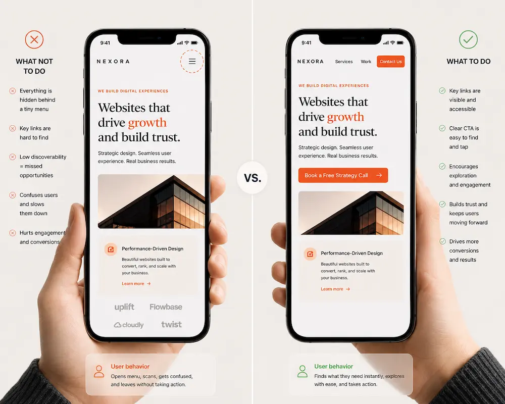
Decision 1 – The Hierarchy Decision: What does your visitor see first?
Visual hierarchy is the order in which a person’s eye moves down the screen – what stands out first, what comes second, and what gets skipped entirely.
On a large desktop monitor, you can place a lot of content at once and let the visitor scan across it.
On a phone, there is one visible slot at the top of the screen. What goes in it is a decision.
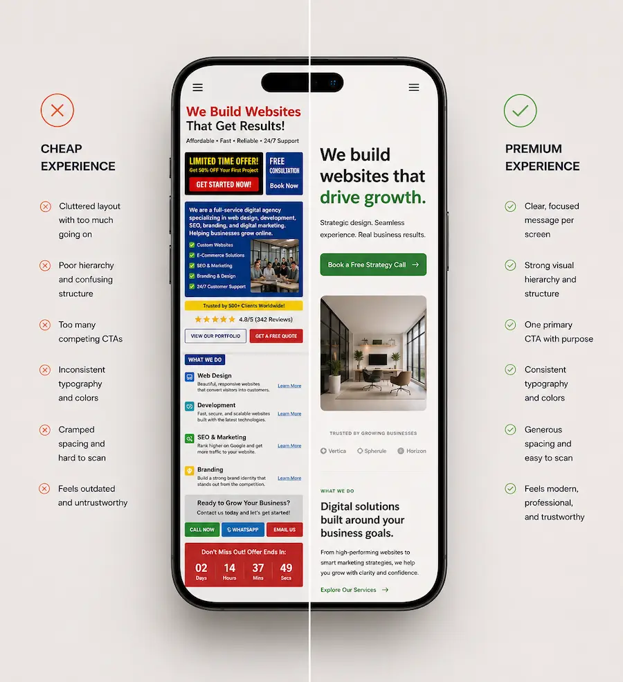
Most sites fill it badly. Logo, navigation bar, hero banner, headline, and subheading all compete for attention in the first few inches. When nothing is clearly more important than anything else, nothing reads as important at all.
| Bad hierarchy | Good hierarchy |
| ❌ Logo and navigation compete with the headline for attention | ✅ One bold headline instantly owns the screen |
| ❌ Headline feels generic or visually underpowered | ✅ Headline is sharp, dominant, and impossible to miss |
| ❌ Subheading is almost as loud as the headline | ✅ Subheading quietly supports, never competes |
| ❌ CTA appears too early or blends into the layout | ✅ One clear CTA sits where the thumb naturally rests |
| ❌ Badges, icons, and images all fight for attention | ✅ Everything else is pushed back to support the main message |
| ❌ The screen feels “full” but directionless | ✅ The screen feels simple, but intentional |
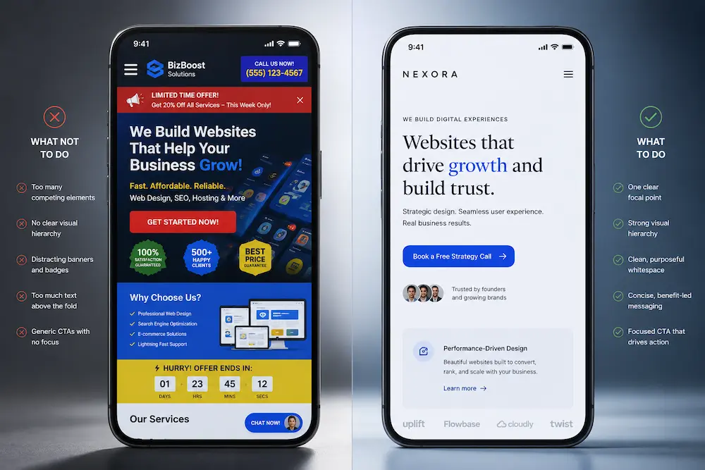
The single most effective mobile design move is deciding what one thing a new visitor should see first, and making everything else visually subordinate to it.
Founder’s Takeaway: Open your site on your own phone right now. The first thing your eye lands on – is that what you’d want a new visitor to notice? If not, that’s the hierarchy conversation to have with your designer or developer before anything else.
Decision 2 – The Typography Decision: Is your text actually readable?
Typography on mobile is not about choosing a beautiful font. It comes down to three numbers: font size, line height, and line length. Get these wrong and your text will feel tiring to read, even if the visitor cannot explain why.
Line height – why cramped text feels cheap
Line height is the space between lines of text. Picture the gap between rows in a spreadsheet. Too tight and the lines blur together. Too loose and the text floats apart without rhythm.
For body text on a phone, a line height of 1.5 to 1.6 times the font size gives comfortable reading without wasting screen space. Most default themes do not set this correctly for mobile.
| 📱 You can test this in under 10 seconds
Open the Notes app on your phone and paste a paragraph from your website. Now compare it mentally to how your site looks in a browser: -If the Notes You can test this in under 10 seconds version feels easier to read → your site spacing is likely too tight This works because you’re removing design bias and seeing raw readability. |
Cramped text is one of the fastest ways to make a site feel unfinished.
Design practitioners at Supercharge.design have observed that “inconsistency in spacing, sizes, typeface usage, and font usage can be a massive sign of amateurism” – and visitors feel this, even when they have no word for it.
Line length – why wide text is hard to follow on a phone
Line length (sometimes called “measure”) is how many characters fit on a single line before the text wraps to the next. The comfortable reading range is 45 to 75 characters per line.
On a phone with no left or right padding, text can stretch across the full screen width. The eye struggles to track from the end of one line to the start of the next, and reading becomes subtly exhausting.
| 📏 Line length: the hidden readability killer
Even if spacing is correct, text can still feel uncomfortable if lines are too wide. A comfortable range is 45–75 characters per line on mobile content blocks. When text stretches edge-to-edge on a phone: -Your eye has to travel too far horizontally |
The fix is simple: add left and right padding to your body text so each line stays shorter and easier to follow.
Founder’s Takeaway: Open a blog post or product description on your site on your phone. If you catch yourself losing your place mid-sentence, the line height or line length is likely off. Screenshot it and share it with your developer – they’ll know exactly what to change.
Decision 3 – The Whitespace Decision: Why your page feels more cramped than it needs to
Whitespace is the empty space around and between elements on a page. It is not wasted space. It is breathing room. It makes a page feel organised, calm, and – when done well – premium.
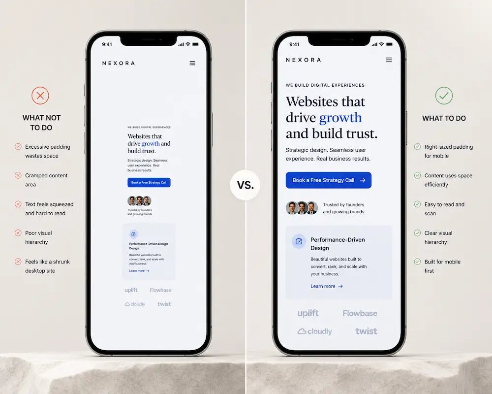
The most common mobile whitespace problem is not that designers forgot to add it. It is that the spacing from the desktop version carries over to mobile unchanged.
On a desktop screen 1,400 pixels wide, a 60-pixel left margin looks generous. On a phone screen 390 pixels wide, that same 60-pixel margin eats up 15% of the total available space. Desktop padding that felt balanced on a large screen makes a mobile layout feel suffocating.
This is one of the most common complaints in WordPress.org support forums: padding settings from desktop layouts carry over to mobile and reduce the usable space significantly – without anyone consciously deciding that should happen.
Your mobile padding should be set independently from your desktop padding. This is a small change with a visible effect on how spacious and premium the mobile version feels.
| 📱 Here’s a quick way to see spacing issues instantly
Open your homepage on your phone and do this: -Scroll until you see a normal content section (text + image or text only) If the content feels like it is squeezed into a narrow vertical column with heavy margins on both sides, that is a whitespace issue — not a content issue. A simple comparison test: -If it feels more spacious on desktop than mobile → spacing hasn’t been rebalanced |
Founder’s Takeaway: This is a quick test. Open your homepage on a phone and look at how much of the left and right edge is empty margin. If the content area feels narrow and squeezed, ask your developer to set the mobile padding separately from the desktop settings – it usually takes under an hour to fix.
Decision 4 – The CTA Decision: Can a thumb actually reach your button?
A CTA (call to action) is any button or link designed to prompt a visitor to do something – “Buy Now,” “Book a Call,” “Get Started.” On mobile, two things determine whether that button actually works: its size and where it sits on the screen.
Tap target size is the tappable area of a button – the physical space a fingertip needs to hit it accurately. The minimum recommended size is 44 by 44 pixels, roughly the size of a small fingertip. Below that, visitors miss the button, tap the wrong element, or simply give up.
The thumb zone is the part of the screen a thumb can naturally reach when holding a phone in one hand. On most phones, this is the lower two-thirds of the screen.
Content pinned to the very top – such as a “Contact Us” button in the header – sits in the most physically awkward spot a thumb has to reach. Your primary CTA should live in the thumb zone, not at the top of the page.
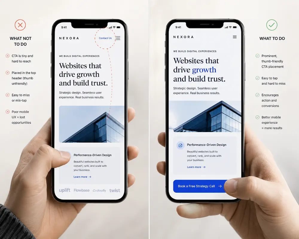
According to Baymard Institute’s mobile checkout research, 63% of mobile sites have mediocre or worse checkout UX performance – and tap target and button placement issues are consistently among the cited causes.
| 📱 Test this with your thumb, not your eyes
Open your website on your phone and hold it the way you normally do in one hand. Now try this: -Can you tap your main CTA without shifting your grip or using your other hand? That small friction is the difference between a CTA that gets clicked and one that gets ignored. A quick mental test: -If your thumb naturally lands near your CTA → placement is working |
For a broader look at how decisions like this connect to actual sales, 12 ways to boost your eCommerce conversion rate covers the full picture.
Founder’s Takeaway: On your phone, try tapping your main CTA button using your thumb in your normal one-handed grip. If you have to shift your hold or switch to a finger, the button is in the wrong place. The fix is to move it further down the page.
Decision 5 – The Navigation Decision: How do people move around your site on a phone?
Desktop navigation usually lives as a horizontal bar across the top – six or seven links, always visible.
On a phone, that bar collapses into what is called a hamburger menu: three stacked horizontal lines that expand into a full list when tapped. (The name comes from the visual: those three lines look like a burger between two buns.)
The hamburger menu is standard on mobile. It is also nearly invisible to first-time visitors. Most people do not tap it unless they already know what they are looking for. If your site relies on navigation to help visitors discover what you offer, a hidden menu will not carry that weight.
The navigation decision is really a priority decision. What are the two or three things a visitor is most likely to want?
Those links belong in persistent, visible spots. A sticky nav bar – one that stays fixed at the top of the screen as the visitor scrolls – can keep the most important links reachable throughout the page without eating much space.
| Hidden / default navigation (Bad) | Intentional navigation (Good) |
| ❌ Relies entirely on the hamburger menu for discovery | ✅ Key pages are surfaced directly on the screen |
| ❌ Important links are hidden behind a tap | ✅ Top 2–3 priorities are always visible |
| ❌ First-time visitors often don’t open the menu at all | ✅ Visitors can understand what to explore instantly |
| ❌ Navigation is treated as a layout default, not a decision | ✅ Navigation reflects business priorities clearly |
| ❌ Users must “hunt” for what they need | ✅ Users are guided toward the most important paths |
| ❌ Menu feels like a dumping ground for all links | ✅ Navigation is simplified to reduce cognitive load |
Founder’s Takeaway: Look at your mobile navigation with a stranger’s perspective. If someone landed on your site for the first time, could they find your three most important pages without tapping the menu at all? If not, consider making one or two of those links permanently visible.
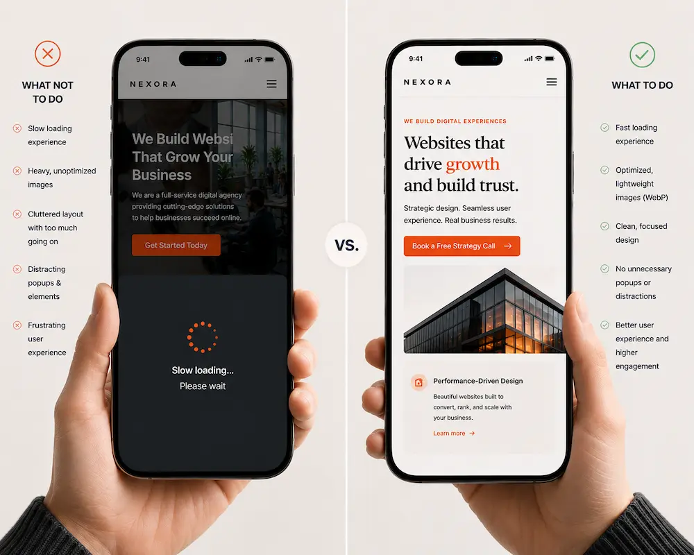
Decision 6 – The Speed Decision: Slow is a design failure, not just a technical problem
Speed is usually framed as a backend or hosting concern. It is also a direct result of design decisions.
Every image on a page carries a file size. Every animation adds loading time. Every third-party widget – a chat bubble, a review badge, an embedded social media feed – requires the browser to make an additional request before your page can appear. These are design choices. And on a phone, on a mobile data connection, they accumulate fast.

Google’s research on mobile performance is direct: a one-second delay in mobile load time can reduce conversions by up to 20%. If your site takes four seconds to load, you have likely already lost more than half your visitors before they have read a single word.
A beautifully designed mobile site that loads slowly is still a failed mobile experience.
| 📱 The Speed Decision: Why “feels slow” is already too slow
Open your website on your phone (use mobile data, not Wi-Fi). Now observe this sequence: -Does anything appear within the first 2–3 seconds? 👉 If it feels like you’re waiting for the page to “arrive,” it’s already too slow. A simple benchmark: -Instant feel → strong mobile experience |
For a practical starting point on diagnosing your own site’s speed, is your eCommerce website fast? and the WooCommerce speed optimisation FAQ are worth reading alongside this article.
Founder’s Takeaway: Go to Google’s free PageSpeed Insights tool (search “PageSpeed Insights,” type in your URL, and select Mobile). A score below 70 is worth investigating. The report tells you and your developer exactly what is slowing things down – you don’t need to interpret it yourself.
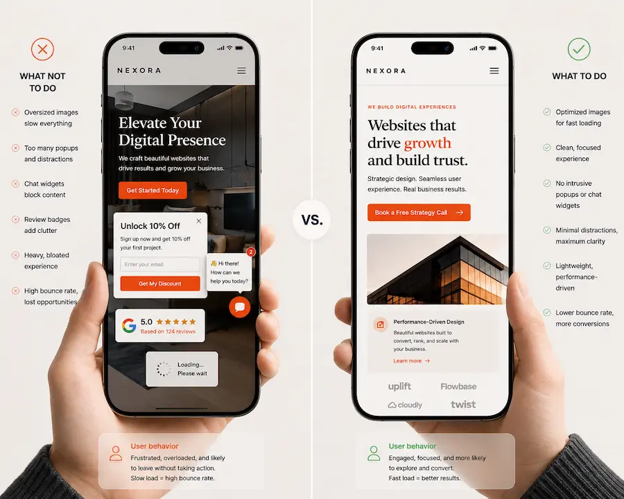
Decision 7 – The Image Decision: What your images are doing to the experience
Images are the biggest single contributor to slow mobile load times. They are also one of the most powerful ways to create a premium feel – or quietly undermine it.
Image weight is the file size of an image. A high-resolution photo from a camera or stock site can weigh 3 to 5 megabytes. That same image, compressed and saved in a modern format called WebP (a smaller, faster image format designed specifically for the web), can weigh under 150 kilobytes and look identical to the human eye.
Most small business websites carry images that are 10 to 20 times heavier than they need to be.
Lazy loading is a technique – now built into most modern website platforms – where images only load when the visitor is about to scroll to them, rather than all at once when the page first opens.
Enabling it on a content-heavy site can cut initial load time significantly without removing a single image.
There is a design decision here beyond the technical one. A full-width hero image (the large banner across the top of a page) that looks dramatic on a widescreen monitor can look cropped and disorienting on a phone.
Some images are better replaced or removed entirely on mobile. That is a call your designer should make deliberately, not leave to chance.
| Bad image handling | Good image handling |
| ❌ Large, uncompressed images slow down initial load | ✅ Images are compressed and load quickly (often WebP format) |
| ❌ Stock-heavy visuals make the site feel generic | ✅ Visuals feel intentional, not decorative |
| ❌ Images load late or shift the layout while scrolling | ✅ Lazy loading improves smooth scrolling experience |
| ❌ Hero images get cropped awkwardly on mobile | ✅ Hero images are designed specifically for mobile framing |
| ❌ Visuals feel inconsistent across sections | ✅ Images support content instead of slowing it down |
Founder’s Takeaway: Ask your developer to check the file sizes of your homepage images. If any are over 500KB, they can be compressed without any visible quality loss. It is a fast job, and the difference in how quickly and cleanly your site loads is noticeable immediately.
Decision 8 – The Content Cut Decision: What you leave out matters as much as what you keep
Desktop websites are built for a wide canvas. Sidebars, multi-column grids, image sliders (rotating banners that automatically cycle through multiple images), and dense panels of text all work reasonably well on a large screen.
On a phone, the same elements tend to produce visual noise – too many things asking for attention at once, none of them clearly winning.
The content cut decision is the one most founders skip, because cutting feels like losing.
But on mobile, restraint is a deliberate design choice. Progressive disclosure is the principle of showing the most important thing first and letting the visitor choose to see more if they want it.
On a phone this means: one clear message per screen, one action at a time, and an active decision about what simply does not need to be there.
As design researchers at Hoverify note in their work on mobile psychology, “if users must zoom in, reread lines, or struggle with spacing, the site immediately feels less trustworthy and less professional.” Overcrowded screens are one of the most reliable sources of that feeling.
| 📱 A fast way to see if your page is overcrowded
Open your homepage on your phone and scroll through the first two screens. Now pause and ask: -Can I clearly tell what this page wants me to do? 👉 If you feel like you’re interpreting the page instead of absorbing it, it’s overcrowded. |
If you run an online store, the content decisions on product pages, category pages, and checkout are especially high-stakes. Our WooCommerce development work regularly involves these exact calls – what to show, what to collapse, and what to cut entirely on mobile.
Founder’s Takeaway: Open your homepage on your phone and count how many distinct things are competing for your attention in the first two scrolls. If the answer is more than three, something probably needs to go. Start with anything that rotates, animates, or displays multiple things at once – those are the first candidates to simplify or remove on mobile.
| Your 8-Point Mobile Design Audit
A quick founder-friendly way to spot what’s quietly making your mobile experience feel premium — or frustrating. Open your website on your phone. Scroll like a first-time visitor. For each question below, mark Yes / No. 1. First Impression: Is the right thing getting attention first? Good sign: One obvious message or CTA stands out. 2. Readability: Does your text feel effortless to read? Quick check: Red flag: You lose your place mid-sentence. 3. Spacing: Does the page feel calm or cramped? Good sign: Content has breathing room. 4. CTA Reachability: Can your thumb comfortably tap the main button? Quick test: Can you easily tap your main CTA without shifting your grip? 5. Navigation: Can someone find key pages without opening the menu? Quick test: Can they find your 2–3 most important pages instantly? 6. Speed: Does the site feel instant? Good sign: Feels immediate. 7. Images: Are visuals helping the experience or slowing it down? Good sign: Images look clean, load quickly, and fit naturally. 8. Content Focus: Is there too much competing for attention? Quick test: Are there more than 3 things competing for attention? Your Score 0–2 No’s → Your mobile experience is likely stronger than most. Fine-tuning will make the difference. Founder’s Rule of Thumb: Start with the two issues a first-time visitor would notice fastest — usually hierarchy, readability, or CTA placement. Small mobile improvements compound quickly. |
Your mobile experience is rarely the real problem. It’s usually the symptom.
If you found yourself saying “Yep, we have that issue” more than a few times in this article, the problem is probably bigger than button size or spacing.
Mobile friction usually shows up because the website was never designed around how visitors actually decide, trust, and take action. The mobile version just exposes it faster.
That’s where a conversion-focused web design approach becomes different.
If you’re wondering whether your current site simply needs a few mobile fixes or whether the bigger experience is holding conversions back, here’s how we usually work:
| 1. A quick conversation (30 minutes) We understand where your site stands today, what is working, what feels off, and where mobile friction may be affecting trust or conversions. No sales deck. Just a practical conversation. 2. A clear recommendation 3. A conversion-focused build 4. Review, refine, launch 5. You own the outcome |
FAQ
1. My site is already responsive. Isn’t that enough?
Not always. Responsive simply means your site adjusts to fit a smaller screen. It does not automatically fix spacing, readability, navigation, button placement, or mobile usability. A site can be responsive and still feel frustrating on a phone.
2. What is the fastest way to check if my mobile experience is good?
Open your site on your own phone and try completing the main task a visitor would come for — booking a call, finding a service, or making a purchase. If anything feels slow, cramped, confusing, or hard to tap, visitors are likely feeling it too.
3. Which mobile issue hurts conversions the most?
Usually not one big thing — small friction points add up. Poor CTA placement, slow load time, hard-to-read text, and cluttered screens are among the biggest reasons visitors leave without taking action.
4. Do I need a full redesign to fix mobile issues?
Rarely. Many improvements — spacing, typography, button size, image optimization, and navigation tweaks — can often be fixed without redesigning the entire website.
5. Does mobile design affect SEO?
Yes. Google uses mobile-first indexing, meaning the mobile version of your website plays a major role in rankings. Slow load times and poor mobile usability can affect visibility in search.
6. What should I fix first?
Start with the first impression: hierarchy, readability, and CTA placement. If visitors cannot quickly understand what you do or take action comfortably on mobile, everything else matters less.