
You must have come across one of these terms while building your WordPress website. A mobile-friendly, responsive theme is quite imperative considering nearly 60% of your visitors are bound to view it on a mobile device. Implementing a WordPress mobile menu without a plugin ensures optimal navigation for these users.
So why should your website’s menu be left behind? :D
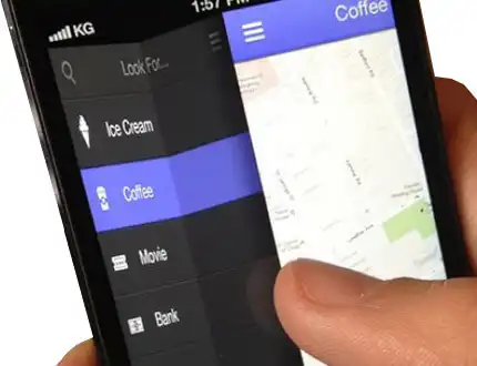
Now, the way the menu is displayed is one part of making the menu responsive. So, if your primary navigation menu is in the form of a list on a desktop device, the same menu can be displayed as a hamburger menu on a mobile device.
We have a great article here, which explains ‘How to Add Pushy Navigation Menu‘ in your theme.
But! To make the menu mobile-friendly, you might want to alter the content that is displayed in the menu.
For example, the WisdmLabs website! If you take a look at the website on a mobile device (or if you’re on one right now), you’ll notice that the main menu is not a mega menu. On the other hand, the main menu on a desktop device is a downright mega menu.

Now, to display a different menu on a mobile device, your theme needs to allow you to create a DIFFERENT WORDPRESS MOBILE MENU.
While there are various WordPress mobile menu plugins available, this guide focuses on creating a custom mobile menu without relying on plugins. Alternatively, plugins like WP Responsive Menu can simplify the process of creating a mobile-friendly menu.
Why a Mobile Menu Matters in WordPress
Mobile phones have become super convenient for users nowadays, with many spending hours browsing on their devices. Building a WordPress platform that makes mobile navigation easy is a game-changer when it comes to boosting conversions. A well-designed mobile menu helps users find what they need quickly.
Clear, mobile-friendly navigation guides users through your funnel—whether that’s signing up for a course, making a purchase, or anything else.
This not only saves users’ time but also builds trust in your business. Plus, a responsive mobile menu helps reduce bounce rates because users are more likely to stick around when they can easily find their way around your site.
How to Create a Mobile Menu on Your WordPress Website
Option 1: How to Add a Custom Mobile Menu Manually (No Plugin Needed)
If you’re interested in creating a dynamic navigation menu, refer to our guide on how to create a simple and dynamic navigation menu in WordPress.
- Register a Mobile Menu in functions.php
- Display the Mobile Menu in header.php
- Style Your Mobile Menu with CSS
- Add Toggle Functionality with JavaScript (Optional but Recommended)
All you need is just a little knowledge of jQuery and some PHP coding and you have endless possibilities. For advanced customization, learn how to add buttons and menu options to TinyMCE in WordPress.
The files for which the changes is to be made are as follows:
#1 Register a Mobile Menu in functions.php
-
Go to Appearance > Theme Editor in your WordPress dashboard
- Open the
functions.phpfile - Add this code to register a mobile-specific menu:
function register_mobile_menu() {
register_nav_menu('mobile-menu', 'Mobile Menu');
}
add_action('after_setup_theme', 'register_mobile_menu');
✅ This tells WordPress to create a new menu location called mobile-menu.
Once you have added this code, you should notice a ‘Mobile Menu’ option in the menu settings.

Not a developer? Let our experts do the grunt work for you!
Make your site mobile responsive!
#2 Display the Mobile Menu in header.php
-
Open your
header.phpfile from the theme editor -
Add this snippet where you want your mobile menu to appear (usually inside
<header>):
<?php
if (wp_is_mobile()) {
wp_nav_menu(array(
'theme_location' => 'mobile-menu',
'container' => 'nav',
'container_class' => 'mobile-menu',
));
}
?>
✅ This code checks if the visitor is using a mobile device and displays the mobile-specific menu accordingly.
#3 Style Your Mobile Menu with CSS
- Go to Appearance > Customize > Additional CSS
- Paste the following CSS to hide/show and style your mobile menu:
/* Hide mobile menu by default */
.mobile-menu {
display: none;
}
/* Show it only on smaller screens */
@media (max-width: 768px) {
.mobile-menu {
display: block;
background-color: #333;
padding: 10px;
}
.mobile-menu ul {
list-style: none;
padding: 0;
}
.mobile-menu li {
padding: 10px 0;
}
.mobile-menu a {
color: #fff;
text-decoration: none;
}
}
✅ This ensures your mobile menu only appears on screens narrower than 768px and looks clean.
#4 Add Toggle Functionality with JavaScript( Optional but Recommended)
Want to give users a hamburger-style toggle menu?
Here’s how:
1. Create a script.js file in your theme directory
2. Add this JavaScript code:
document.addEventListener(“DOMContentLoaded”, function() {
var menuButton = document.getElementById(“mobile-menu-toggle”);
var menu = document.querySelector(“.mobile-menu”);
menuButton.addEventListener(“click”, function() {
menu.classList.toggle(“open”);
});
});
3. Add this toggle button inside your header.php:
<button id=”mobile-menu-toggle”>☰</button>
4. And update your CSS like this:
.mobile-menu.open {
display: block;
}
✅ Now your menu will slide open when users tap the hamburger icon.
Option 2: Use a Plugin (Perfect for Beginners)
Not into coding? No worries—there are several plugins that’ll get your mobile menu working in minutes.
Here are some great options:
| Plugin | Why It’s Great |
|---|---|
| Responsive Menu | Over 150 customization options with easy drag-and-drop controls |
| WP Mobile Menu | Clean UX, no code needed, works with most themes |
| Max Mega Menu | More advanced—great if you need dropdowns or mega menus on mobile |
✅ These plugins save time and reduce the chance of breaking your theme—but always test them before pushing changes live.
Conclusion
And there you have it! You have just added a mobile menu to your WordPress theme! Quite simple wasn’t it? You can similarly add different menus, based on different screen sizes, or register a footer menu. (If you don’t know how to set a footer menu, this article will surely help).
If you want to add a mobile menu to your WordPress site without doing the code work, let our WordPress development experts who are also WordPress core contributors make the job easy for you. They use scalable code and make sure your site is optimized for fast loading times both on mobile and desktop!
If this article has helped you to add mobile menu in WordPress or if you still have some doubts be sure to drop me a line using the comment section below :-)
Bonus: Here is the Master WordPress Mobile-Optimization Guide, made for people looking to create a great mobile experience for their users!