| A WordPress site can look modern and still feel oddly “empty” to users, like it’s polished, but not guiding them anywhere. If people can’t quickly understand what you do, who it’s for, and what to do next, they’ll scroll, hesitate, and leave. This post breaks down the quiet UX and clarity issues that cause that gap, and what actually makes a site convert. |
A WordPress website can look stunning and still quietly fail.
Clean layouts. Modern typography. Smooth animations.
Yet traffic doesn’t convert, enquiries don’t come in, and users leave without taking action.
This is one of the most common problems in website design WordPress projects today:
Teams optimize for how the site looks instead of how the site actually works for users.
This article explains why good-looking WordPress sites still fail, why UX and clarity matter more than visuals alone, and what truly separates high-performing sites from pretty but ineffective ones.
Who this article is for
This guide is especially useful if:
- Your WordPress site looks modern, but underperforms
- You get traffic, but users don’t take action
- Stakeholders say “the site looks good” but results disagree
- You’re planning to redesign your website on WordPress and want it to actually work
If your site feels polished yet ineffective, this article will help you identify why.

The core misconception: Design does not equal effectiveness
The biggest myth in web design is that visual appeal equals success.
In reality:
- Visual design attracts attention
- UX and clarity drive decisions
A site can impress users for a few seconds—and still fail to help them:
- Understand what you offer
- Know who it’s for
- Decide what to do next
That gap between beauty and usability is where most WordPress sites struggle.
Looks good vs works well: What users actually experience
Most failing sites don’t look bad. They just don’t work well.
| Looks Good | Works Well |
| Clean hero section | Clear value proposition in 5 seconds |
| Trendy animations | Fast, predictable interactions |
| Minimalist layouts | Obvious next steps |
| Fancy typography | Readable hierarchy |
| On-brand visuals | Intent-driven page structure |
A successful website design WordPress project ensures that “looking good” supports usability—not replaces it.
The silent UX signals Google watches (but designers ignore)
A visually polished site can still send negative signals to Google without obvious technical errors.
These “silent” metrics matter:
- Short dwell time – users leave quickly
- Pogo-sticking – users return to search results
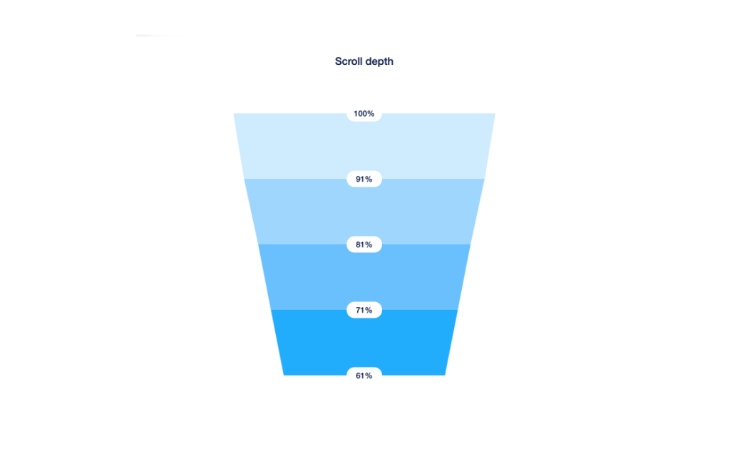
- Low scroll depth – content doesn’t guide users
- Weak internal clicks – navigation doesn’t support exploration
These are not aesthetic signals.
They are clarity and usability signals.
When users don’t understand what to do next, Google assumes the page failed to meet intent—even if it looks great.

1. The site looks great, but the message is unclear
The problem: Users land on your site and can’t immediately answer:
- What is this?
- Who is this for?
- Why should I care?
Design polish often hides weak messaging.
What users experience
They scroll aimlessly. They skim without understanding. They leave without confidence.
Strategic fix:
- Focus on clarity before creativity.
- Make the value proposition obvious at first glance.
- Write for understanding, not cleverness.
- No visual upgrade can make up for unclear positioning.
2. Visual hierarchy exists—but not decision hierarchy
The problem: Pages look balanced, but users don’t know where to click.
This happens when:
- Everything looks equally important.
- CTAs blend into the design.
- There’s no clear primary action.
User impact: Decision fatigue. Hesitation. No conversions.
Strategic fix:
- Design each page around one primary goal.
- Use hierarchy to guide action, not just layout.
- Remove competing CTAs.
- A calm-looking page that asks users to decide everything usually converts nothing.
3. Navigation looks elegant but breaks user flow
The problem: Menus are stylish but confusing.
Common issues:
- Too many options.
- Vague labels.
- Deep nesting.
- Mobile menus that turn into scroll walls.
User impact:
- Users scan instead of navigating.
- Important pages are missed.
- Journeys break early.
SEO impact:
Poor navigation increases bounce rates and weakens internal linking signals.
Strategic fix:
- Design navigation around user intent, not internal structure.
- Prioritize key journeys.
- Treat navigation as a UX system, not decoration.
- Navigation clarity matters more than aesthetics.

4. When modern UI trends work against your users
Many WordPress sites fail because they adopt trends blindly:
- Ultra-minimal copy that explains nothing
- Hidden navigation behind icons that users don’t recognize
- Scroll-triggered content that delays information
- Low-contrast text chosen for style over readability
These patterns look great in portfolios—but fail in real-world usage.
A redesigned website on WordPress should challenge trends, not copy them.
Good UX is timeless.
Bad UX just looks modern.
5. Animations impress, but interactions frustrate
The problem
Micro-interactions and animations look premium—but slow users down.
Examples:
- Delayed hover effects
- Over-animated transitions
- Scroll effects that hide content
User impact
- Slower perceived speed
- Frustration on mobile
- Abandonment
Strategic fix
- Use animation to support clarity
- Prioritize responsiveness over flair
- Test on real devices, not just desktop
Good UX feels fast—even when it’s simple.
6. The Clarity Stack: what actually makes a WordPress site work
1) Message clarity:
What it means: Visitors instantly understand what the site is and who it’s for.
Common failures: Vague headlines, generic hero copy, unclear positioning.
How to fix it: Lead with a specific promise + audience + outcome. Support it with one proof point.
Real example: “LearnDash LMS support for training teams” beats “Powerful eLearning Solutions.”
Quick test: Can users explain what you do and who it’s for in 5 seconds?
2) Intent clarity:
What it means: The next step is obvious, and it matches what the visitor came to do.
Common failures: Competing CTAs, buried primary action, “Learn more” everywhere.
How to fix it: Choose one primary CTA per page and make it repeat predictably.
Real example: A service page with “Book a call” as the only primary CTA outperforms mixed CTAs.
Quick test: Can users point to what they should do next without scrolling?
3) Structural clarity:
What it means: Information is grouped in a logical order, so scanning works.
Common failures: Random section order, repeated ideas, and important details hidden in paragraphs.
How to fix it: Use a clean hierarchy: problem → solution → proof → details → CTA.
Real example: Pricing and inclusions placed after proof reduces “sticker shock” exits.
Quick test: Can users find pricing, timeline, or key features in under 10 seconds?
4) Navigation clarity:
What it means: Users can move confidently without second-guessing where things live.
Common failures: Overloaded menus, inconsistent labels, mobile nav that collapses everything.
How to fix it: Use task-based labels, limit top-level items, and keep mobile interactions predictable.
Real example: “Services / Work / About / Contact” beats 10 menu items with overlapping meaning.
Quick test: Can users find a specific page (like “Pricing” or “Case Studies”) in one click?
5) Interaction clarity:
What it means: Buttons, forms, and UI elements behave exactly as users expect.
Common failures: Slow dropdowns, broken validation, surprise page reloads, unclear error states.
How to fix it: Reduce friction: fewer fields, clear inline errors, fast feedback, consistent components.
Real example: A checkout that shows shipping and totals early reduces abandonment.
Quick test: Can users complete the primary action once without confusion or errors?
7. Mobile UX is treated as a scaled-down desktop version
The problem
The site looks great on desktop but feels overwhelming on mobile.
Signs include:
- Long scrolls with no guidance
- Small or buried CTAs
- Overloaded menus
- Important content pushed too far down
SEO consequence
Mobile usability issues directly affect rankings.
Strategic fix
- Design mobile-first user journeys
- Prioritize content visibility
- Simplify interactions instead of shrinking layouts
If mobile users struggle, the site struggles.
Where visuals actually matter
We talk a lot about clarity—on purpose.
Clear structure, clear messaging, and clear paths to action are what make a website work.
But clarity doesn’t mean “ignore design.”
Visual design still plays a critical role when it’s doing a specific job.
When visual design actually drives results
- Trust signals
Professional, considered design builds immediate credibility. Users decide whether you’re “legit” in seconds—and visuals carry that judgment before a single word is read. - Brand differentiation
Visual identity is what separates you from competitors saying similar things. Typography, spacing, color, and tone are often the only cues users remember. - Attention direction
Good design creates hierarchy. It guides the eye, highlights what matters, and quietly nudges users toward the next step—without forcing it. - Emotional connection
Aesthetics shape how a site feels. Calm, confident, premium, approachable—those signals come from design, not copy alone.
The real point
The point isn’t that design doesn’t matter.
It’s that design without clarity is decoration, not strategy.
The strongest websites don’t choose between clarity and beauty.
They use visual design in the service of clarity—to reinforce meaning, guide decisions, and make the experience feel effortless.
Are you looking forward to strategically redesigning your website? Get in touch with us
Why most WordPress redesigns don’t fix the real problem
Many teams jump into a redesign because:
- The site feels outdated
- Competitors redesigned
- Stakeholders want a fresh look
But if the redesign focuses only on visuals, the same issues remain:
- Unclear messaging
- Weak navigation
- Poor mobile flow
- Confusing CTAs
A redesign works only when it rethinks:
- User journeys
- Content order
- Decision friction
Otherwise, you get a better-looking version of the same failure.
Before you redesign: A quick clarity self-diagnostic
Ask these questions honestly:
- Can users understand your offer in under 5 seconds?
- Is there one clear primary action per page?
- Does navigation guide rather than overwhelm?
- Are CTAs placed after value is clear?
- Is mobile usability better—not worse—than desktop?
- Can users reach key pages in 2 clicks or less?
- Do interactions behave predictably?
If more than two answers are “no,” visuals aren’t the issue—clarity is.
Who benefits most from clarity-first WordPress design
Clarity-first website design, WordPress approaches work especially well for:
- B2B service businesses
- SaaS and product-led companies
- High-ticket offerings
- Content-heavy platforms
- Trust-driven decision journeys
If users need to think before converting, clarity always beats visual flair.
Final takeaway: Clarity beats beauty every time
A beautiful WordPress site can attract attention.
A clear WordPress site earns trust and action.
The most effective website design WordPress projects focus on:
- User understanding
- Intent-driven structure
- Frictionless navigation
- Confident decision-making
Because users don’t convert because a site looks good.
They convert because it makes sense.


