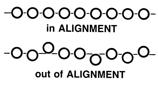
| Design–development misalignment breaks WordPress websites when what’s designed can’t be implemented consistently in the theme, so key UX patterns (especially navigation) become messy, slow, and hard to maintain, and that quietly reduces trust, conversions, and SEO. |
Navigation is not “just a menu.” On complex WordPress websites, it’s a decision system—the thing that tells users (and Google) what matters, where to go next, and how fast they can get there.
And here’s the part most teams miss: the navigation layer is where design intent and development reality collide.
Design–development misalignment shows up first in menus. A layout looks clean in Figma but behaves differently in the theme. Mobile interactions fall back to a generic drawer. Mega menus load slowly. Labels stop making sense. Updates become risky. Conversions quietly dip.
This guide explains 7 ways misalignment breaks navigation, the common mistakes behind it, and how to fix it strategically—especially if you’re dealing with menu customization in wordpress across multiple templates, audiences, and content sections.
Who this guide is for
This article is built for teams running complex WordPress sites, like:
- B2B businesses with multiple services and industries
- SaaS sites with feature pages, docs, and pricing pathways
- eCommerce stores with layered categories and seasonal navigation
- Educational/Content-heavy platforms with hundreds of pages
If your menu has “grown organically” over time, this will feel uncomfortably familiar.
What is menu customization in WordPress (and why it’s more than styling)
Menu customization in WordPress isn’t just about changing colors or adding hover effects.
It includes everything needed to make navigation usable, scalable, fast, and maintainable, such as:
- Designing a hierarchy that matches user intent (not CMS structure)
- Defining how multi-level menus behave (desktop and mobile)
- Building consistent navigation components across templates
- Supporting mega menus, grouped links, icons, CTAs, and conditional states
- Ensuring performance doesn’t suffer (Core Web Vitals matter here)
- Making the menu maintainable for editors—not “developer-only”
WordPress gives you a solid base (menu locations, menu editor, theme support), but complex navigation often needs intentional architecture—whether that’s block-based navigation, custom walkers, custom fields, or a controlled plugin approach.
If you want this done cleanly (and without breaking your theme every time you update), explore our custom WordPress development services.
How Google interprets navigation (the SEO angle most teams ignore)
Menus aren’t only for users. They shape how Google understands your site.
Navigation influences:
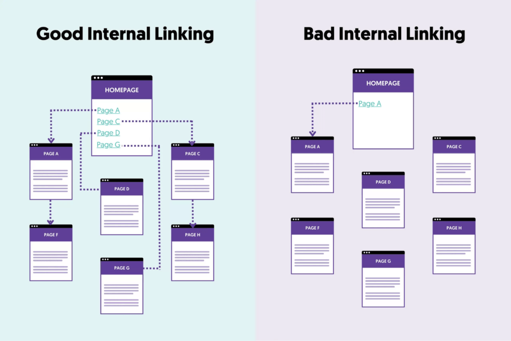
- Internal linking: menus distribute link equity to key pages
- Crawl paths: if important pages are buried, they’re crawled less often
- Information architecture: confusing categories signal weak topical structure
- Engagement signals: bad navigation increases pogo-sticking and bounce
If your menu hides key pages behind heavy JavaScript, inconsistent states, or unclear labels, you’re not just hurting UX—you’re weakening crawlability and rankings.
Common navigation mistakes that disrupt user flow (and hurt SEO)
Here’s a quick view of what typically goes wrong when design and development aren’t aligned:
| Navigation mistake | Misalignment root cause | User impact | SEO impact |
| Overloaded top-level menu | No prioritization rules | Decision fatigue | Higher bounce |
| Deep nesting (3–4 levels) | CMS-first hierarchy | Users get lost | Poor crawl depth |
| Mega menu used as a sitemap | “More links = better” thinking | Scanning, not clicking | Weak internal link focus |
| Mobile menu becomes a scroll wall | Desktop-first design | Drop-offs on mobile | Mobile UX hit |
| Menu behavior differs across templates | Ad hoc dev overrides | Trust breaks | Engagement drops |
| Heavy JS menus | Over-engineering | Slow interactions | Core Web Vitals impact |
| Hardcoded or brittle menu logic | Speed-first dev shortcuts | Updates avoided | Stale IA over time |
Now let’s break down the 7 misalignment patterns that cause these problems.
1) Visual hierarchy that can’t be built cleanly
The problem
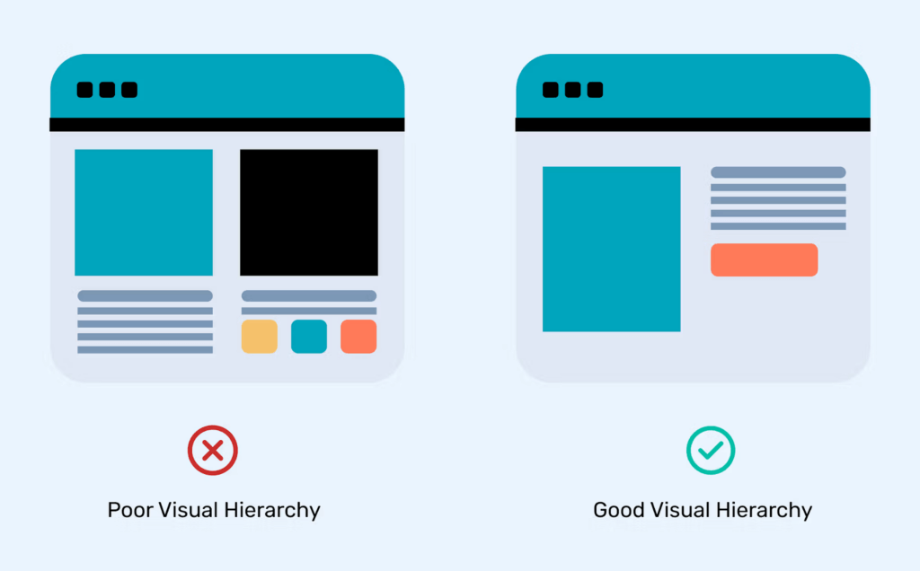
Designs often show multi-level navigation with clear hierarchy: grouped links, separators, highlighted categories, or emphasis on key actions.
But during development, the menu becomes:
- A flat list with uniform styling
- “Close enough” grouping
- Inconsistent spacing and emphasis
Why it happens
- Designers don’t validate feasibility against WordPress’s menu structure
- Developers are forced to approximate using theme defaults
- No shared spec for hierarchy rules (what’s primary vs secondary)
What users experience
Everything looks equally important. Users scan longer, hesitate more, and miss the intended path.
Strategic fix
- Decide upfront: menu depth, grouping logic, and priority links
- Treat navigation as information architecture (not decoration)
- Use structured implementation (custom walkers, controlled fields, or block menus) rather than CSS hacks
2) Desktop-first navigation that collapses on mobile
The problem
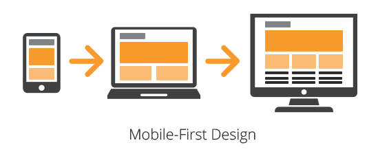
Menus look premium on desktop and turn into a long “tap list” on mobile.
Why it happens
- The desktop design is detailed; mobile behavior is assumed
- Developers fall back to theme-provided mobile menus
- No shared interaction model (accordion vs drilldown vs hybrid)
What users experience
- Endless scrolling inside the menu
- Categories with no clear path to conversion pages
- A “search for the link” feeling
SEO consequence
Bad mobile navigation increases bounce and reduces engagement—signals that can drag rankings.
Strategic fix
- Design mobile navigation first: prioritize the top journeys
- Limit menu items on mobile to what users actually need
- Treat mobile as a different interface, not a collapsed desktop
If you’re serious about menu customization in WordPress, mobile behavior should be a core spec—not an afterthought.
3) Mega menus without a content strategy
The problem
Mega menus appear because the site has lots of pages, not because users need them.
Misalignment in action
- Designers create mega menus for clarity
- Developers implement them as designed
- No one prunes or prioritizes links
Result
The mega menu becomes a visual sitemap. Users don’t decide faster—they just scan longer.
Strategic fix
- Build mega menus around user intent, not internal structure
- Limit choices per column/group
- Highlight 1–2 “main paths” instead of listing everything
| Quick Example A SaaS site with features + use cases + industries adds a mega menu with 40+ links. Users don’t click more—they click less. A better approach is grouping by jobs-to-be-done (e.g., “Automate support,” “Reduce churn,” “Scale onboarding”) and keeping the rest searchable or context-linked. |
4) Navigation built around CMS convenience, not user logic
The problem
Menus mirror WordPress page structure instead of user mental models.
Why it happens
- Developers map menus directly to page trees
- Designers aren’t involved in content modeling
- Labels match internal jargon, not user intent
What users experience
The menu feels “company-facing,” not user-facing. Users hesitate because the labels don’t match what they came for.
Strategic fix
- Decouple navigation from CMS hierarchy
- Rename labels to match how users search and decide
- Group pages into decision-friendly categories
This is exactly where WordPress developer services that include UX + IA thinking matter, because the fix is not just technical, it’s structural.
5) Inconsistent menu behavior across templates
The problem
The same menu behaves differently across pages:
- Sticky on one template, not another
- The dropdown animation differs
- The CTA button appears only in some contexts
- Spacing shifts between pages
Root cause
- Missing “navigation system rules” document
- Conditional logic added over time
- Theme overrides are stacking up across templates
Impact
Inconsistency breaks trust. Users stop feeling confident that clicking will behave predictably.
Strategic fix
- Define global navigation rules: states, spacing, sticky logic, CTA rules
- Treat navigation as a reusable system component
- Enforce consistency through shared components (not copy-pasted template logic)
6) Performance issues caused by over-engineered menus
The problem
Menus become slow because of:
- Heavy JavaScript
- Large DOM trees (especially mega menus)
- Unnecessary animation libraries
- Icon/font overhead for nav elements
Why it happens
Design wants “premium interactions,” dev implements them quickly, and no one checks the performance cost.
What this hurts
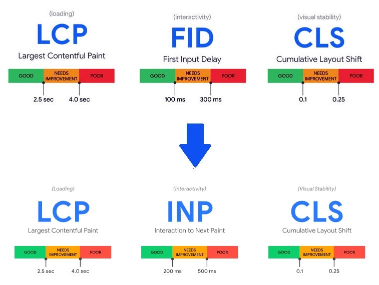
- LCP and INP (user-perceived speed and responsiveness)
- Mobile interaction smoothness
- Core Web Vitals (SEO-relevant)
Strategic fix
- Keep navigation interactions lightweight
- Prefer CSS-first animation patterns
- Lazy-load mega menu content only when necessary
- Audit nav scripts separately from the rest of the page
Navigation performance is page performance.
7) Menus that are impossible to maintain
The problem
The menu is technically “custom,” but updates are painful:
- Adding a link breaks layout
- Changing labels causes wrapping issues
- Editors avoid touching navigation
- New important pages never get visibility
Why it happens
- Hardcoded menu logic
- Brittle CSS tied to specific labels/length
- No editor-friendly controls or guardrails
- Too many “one-off” exceptions
Business impact
Navigation stays outdated, which means your best pages don’t get discovered—by users or by Google.
Strategic fix
- Build menu systems that scale: controlled fields + flexible layout rules
- Design with content variability in mind (long labels, new categories)
- Provide a maintainable structure for teams (not “dev-only navigation”)
This is the long-term side of menu customization in WordPress: if the menu can’t evolve, the site can’t grow.
Quick navigation audit checklist: Is your WordPress menu hurting conversions?
Use this fast checklist to spot problems immediately:
- Can users reach your top conversion pages within 2 clicks?
- Are your menu labels user-intent-based, not internal jargon?
- Does mobile navigation prioritize key journeys (not all pages)?
- Do dropdowns behave consistently across templates and breakpoints?
- Is your menu structure limited to a sensible depth (ideally 2 levels)?
- Do mega menus reduce decisions—or increase scanning?
- Are you relying on heavy JS for basic interactions?
- Can non-technical editors update the menu safely?
- Are important pages getting internal links from navigation (or buried)?
- Does navigation feel stable during real traffic and real usage?
If you checked “no” for 3+ items, it’s not a cosmetic problem—it’s structural.
FAQ: menu customization in WordPress
Is menu customization bad for SEO?
No—done well, it improves SEO because it strengthens internal linking, clarifies site structure, and reduces bounce. The risk is when menus become JS-heavy, inconsistent, or overloaded.
When should I avoid mega menus?
Avoid mega menus when they become a “link dump.” If users scan more than they click, you’re adding friction. Mega menus work best when grouped by intent and limited to key journeys.
Do WordPress themes limit navigation scalability?
Many do. Themes often provide generic menu behavior and styling, but complex sites typically need controlled customization to maintain hierarchy, performance, and editor usability.
What’s a healthy number of top-level menu items?
There’s no single rule, but many high-converting sites keep top-level choices tight (often 5–7). More than that usually signals missing prioritization.
What’s the fastest win to improve navigation conversions?
Prioritize conversion paths and reduce menu clutter. Make sure your most valuable pages are visible, clearly labeled, and consistent across desktop and mobile.
When to bring in WordPress developer services (without turning it into a rebuild)
If your site has multiple audiences, deep content layers, or conversion-driven funnels, navigation should not be improvised.
This is where professional WordPress developer services can help—specifically when they combine:
- Navigation UX + information architecture
- WordPress theme/build expertise
- Performance and Core Web Vitals awareness
- Maintainable implementation for content teams
Good teams don’t just “build menus.” They build decision paths that hold up under growth.
Final thoughts: Alignment is the real optimization
Most WordPress sites treat navigation as a design deliverable or a development task. The best sites treat it as a decision system.
The one that needs design thinking, technical execution, and ongoing optimization to work together
When design and development collaborate early—especially around menu customization in WordPress—navigation becomes:
- Clear for users
- Discoverable for search engines
- Fast on real devices
- Maintainable for teams
- Better at guiding users to conversion pages
That’s not just good UX. That’s a measurable business advantage.
Not sure where your navigation stands? Get a free navigation audit

