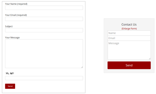
I’ll ask you a question. If I show you two forms, can you tell me the difference between the two, and the reasons for the difference?

Both forms have the same amount of fields. Where they differ, is the amount of space both take. For example, it’s clear that the form on the left, is probably placed on a dedicated page, say a ‘Contact Us’ page. And that is why there is ample space to display field labels. As for the other form (on the right), it appears to be narrower, because it was probably intended for a mobile device, or placed in a sidebar, or pop-up dialog. A lot of information has to be fit in a limited space.
Displaying such information in a limited space, is a challenge I face, and I’m sure a lot of you face. But that’s okay. We just need to integrate an innovative solution.
[space]
Use of Placeholders
If you notice both the forms again, you’ll note a major difference is in the display of labels for the form fields. When there is enough space, you can display labels for form fields, separately. And as for the forms with restricted space, you can skip the labels altogether, and use placeholders.
Placeholders are a great space saver. Although there are certain drawbacks. Sometimes, a user starts typing, and loses the placeholder, and then sometimes forgets what the field stood for. Or when another person is reading the values in the form, it isn’t clear what the fields stood for. So then how do we provide a better solution?
[space]
Using Adaptive Placeholders
Fear not. We can use the power of CSS to provide a better solution to our problem. Introducing the use of Adaptive Placeholders. Adaptive placeholders can be used to switch the position and content of the placeholder, based on user actions.
The above solution can be great for forms to be displayed in a narrow space or on a mobile device. Such an effect can be created using pseudo elements.
Pseudo Elements in CSS
If you want such special effects, you need to use pseudo elements or pseudo classes. The most common use of a pseudo class, is when you want to style an element upon ‘hover’. For example, say you want to style a link on mouse hover. The styling you would need to add, would be as follows:
[pre]a:hover
{
color: #960000
} [/pre]
Similarly for our example today, we will be using such pseudo elements along with the content property, to create the ‘adaptive’ effect.
Adding the ‘Adaptive’ Effect
If we strip down the fancy CSS, we first need to transition the placeholder text from in-between the textbox to above it, and then change the text label.
- First let’s create a simple HTML form, with an input text-field and label
<form>
  <input type='text' />
  <label>Name</label>
</form>
- To transition the label text, we first need to place it in-between the textbox (just like a placeholder). By setting a height for your textbox and by using the margin and padding properties in CSS, we can place the label in-between the textbox.
input[type="text"] {
  height: -webkit-calc(4em);
  height: calc(4em);
}

input[type="text"] + label {
  display: block;
  padding: 0 10px;
  margin-top: -webkit-calc(-2.8em);
  margin-top: calc(-2.8em);
}
- The next step, is to transition the text. This can be done, when the user clicks on the textbox, or enters a value. A user’s action can be captured using the pseudo-classes ‘focus’ and ‘valid’, and the transition effect can be added using the ‘transform’ property.
input[type="text"]:focus + label, input[type="text"]:valid + label {
  -webkit-transform: translate(0, -1.5em);
  -ms-transform: translate(0, -1.5em);
  transform: translate(0, -1.5em);
}
- The final step is to change the label text itself. This can be done using the “before” pseudo-element, which allows us to change the content of a particular element, and in our case, the label content. In this step we will be making use of additional attributes in the label field to change the label text. Thus, we need to change the HTML and CSS as below:
<form>
    <input required='' type='text' />
    <label ph='Enter Name' fl='Your Name'></label>
</form>
input[type="text"] {
  height: -webkit-calc(4em);
  height: calc(4em);
}

input[type="text"] + label::before {
  content: attr(ph);
  display: block;
  padding: 0 10px;
  margin-top: -webkit-calc(-2.8em);
  margin-top: calc(-2.8em);
}
input[type="text"]:focus + label::before, input[type="text"]:valid + label::before {
  content: attr(fl);
  -webkit-transform: translate(0, -1.5em);
  -ms-transform: translate(0, -1.5em);
  transform: translate(0, -1.5em);
}
[space]
If you try the code as is, you might notice it is not as fancy as the working example I’ve shown you above. You can certainly change the styling as per your needs. So go ahead and try it out, and do let me know your thoughts in the comment section below.


One Response
very helpful!